As promised csehz, your name in the good book!
Stygg

 Member
As promised csehz, your name in the good book!
Stygg
Member
The technique I use, whether it's a Xara extrusion or a full 3D model, is to use a very light gray color on the model only. Then, in Xara, I create photorealistic images cut to fit the given perspective to each face of geometry on the model, and then given a 'stain-glass' transparency so you can see the geometry beneath it. So for your book and pedestal, I'd, as said, used a very light color (not white as you want to be able to see geometry, if theres no shading, you can't see it). Then used a marble texture on the pedestral. For the book, I'd place a leather texture on the exposed book cover, white or parchment colored paper with text typed on it (text on a curve) at an appropriate scale for the size of the book (so it would be unreadable at your images current scale) and possibly included page illustration.
Even in expensive 3D applications where fully fitted textures are used, its usually very difficult and complex task. So I cheat by applying textures in Xara, as described above.
 Member
Cheers Stygg thanks I never thought that my name will be formed in gold onceOriginally Posted by stygg2003

That can be only very nice one
But really so the color of the column in harmony with that gold
Member
Thanks for the tips Gameprinter, much appreciated.
Stygg
Member
No, that's all your getting csehz, your name in the book, no gold pedestal, you'll be asking for diamond encrusted edges on book and pedestal before you know it
Stygg
 Super Moderator
That's funny, I was looking for my csehz-book the other day, and all I found was one with pre-printed text marked "1116".
Sorry, csehz! :)
+++++++++++++++++++++++++++++
Text on a book can improve the photorealistic qualities of your work, even if the text isn't legible. Back in 1995 when I had access to PIXAR rendering software, which didn't do texture mapping all that well.
Csehz and GamePrinter: you can type an entire paragraph and don't need to type it on a curve:
I used the Mould tool in one of the first versions of Xara (CorelXARA, perhaps) to bend sonnet 43 by Elizabeth Browning "onto" the cf
My Best,
Gary
Member
Fitting text to curve is the easiest way as that correct curve already exists and there is no need to invent wheel again.
Fitting text to curve is still not enough alone to create believable illusion as the text is not in the correct perspective. For that there is one simple additional step to take, just estimate how much the book has been tilted and then skew the text according to that.
Member
Gary that's a great drawing in #86 so I had another go at the book. I changed the book extrusion colour and added two pages on top, 10% black with texture and shades to give a little "ware" The text I left flat as with the mold tool it appeared not right, that's not to say it looks right now
Stygg
Member
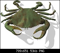
Using the technique I described above, I decided to create an accurate 3D model of a crab you'd find in the ocean using Nendo, as an intended map object for my next map symbol set release. As stated the colors were done in Xara, the model in a 3D modeling app (rendered in Raydream Studio).
Enjoy!
Member
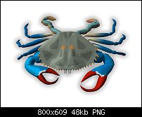
Decided I wanted to alter the colors to alter species of crab, without too much a bother. Here's the same basic crab redressed as a "blue crab" in Xara.
 Posting Permissions


 Reply With Quote

Bookmarks