


 Re: Version 23.7 Blocks
That's going to be my next project, start with the smaller variant. So far (which isn't really far) all the apocalyptic events have been associated with the mobile variant. I'm curious whether going smaller first will allow wiggle room on the larger variant, or just destroy itself as usual, but in a more spectacular way.Originally Posted by bwood

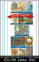
I have a working site where I have an iframe displaying a picture gallery with 40 images. The gallery is made of a single Flexible Block. The pictures are 2 sizes, portrait and landscape. Nothing could go wrong there, right? Just one on top of the other, easy-peasy. More than once, the whole Flexi part (purple bit) expands 30px on the width for reasons I have yet to fathom. I've mucked and messed to try and coax it back to no avail. I either set the 'x' coordinate to -30, or remove the images from the larger variant, delete the entire block, drop a fresh block into the page and drop the images back in. The second, scorched earth method, is cleaner and takes longer to type the how-to than actually do the job.
I select each image by holding Shift, as we can't marquee select (moan moan) drag all 40 out of the block. Then select all 40 and drag them back in to the new block. Not a biggie in this example, but not one I should have to do.

 Reply With Quote

Bookmarks