Welcome to TalkGraphics.com
Results 1 to 10 of 31

Hybrid View

  1. #1
    Join Date
    Feb 2023
    Location
    USA, NJ
    Posts
    37

    Default Re: Never tried Green Screen ie;Chroma Key

    Quote Originally Posted by Chris M View Post
    Creating the text effect is actually straight forward. Tricks of the trade and all that.


    Select the picture and clone it, (Edit > Clone, or ctrl+k. Don’t move either picture.
    Type your text and drag it to the place you want it.
    With the text selected, shift+click the picture.
    Arrange > Combine Shapes > Slice (cut) Shapes, or ctrl+4
    Click the Shadow Tool and choose the Glow Shadow
    Open the colour picker
    Ctrl click the shadow and use the dropper to select a colour from the picture
    Adjust stuff
    Thank you very much! I've got it figured out and when I get the chance I'm going to work on it a bit more to iron out some wrinkles then I'll post it here. You guys are amazing and I cant begin to say how much I appreciate all your tips and tricks! Thanks again!

  2. #2
    Join Date
    Feb 2023
    Location
    USA, NJ
    Posts
    37

    Default Re: Never tried Green Screen ie;Chroma Key

    Quote Originally Posted by Spectra13 View Post
    Thank you very much! I've got it figured out and when I get the chance I'm going to work on it a bit more to iron out some wrinkles then I'll post it here. You guys are amazing and I cant begin to say how much I appreciate all your tips and tricks! Thanks again!
    Hi all, deeply apologize for the lack of response but I got myself locked out and got caught up with editing videos for my dad and I... for six months...
    I did get to work out the effect that Chris M showed but I did have one question, I like that font that you showed but I can't seem to find it anywhere, what font was used, please?

    BR 193 Vectron_2023-10-09_03-59-34_v0.xar

  3. #3
    Join Date
    Dec 2018
    Location
    Australia
    Posts
    1,813

    Default Re: Never tried Green Screen ie;Chroma Key

    The font is from Google and is called Abril Fatface. I probably chose it because Fatface looks like Fartface, and I am a child.

    Link to the font >>> Abril Fatface - Google Fonts <<<

  4. #4
    Join Date
    Feb 2023
    Location
    USA, NJ
    Posts
    37

    Default Re: Never tried Green Screen ie;Chroma Key

    Quote Originally Posted by Chris M View Post
    The font is from Google and is called Abril Fatface. I probably chose it because Fatface looks like Fartface, and I am a child.

    Link to the font >>> Abril Fatface - Google Fonts <<<

    Oh, you mean like my father! LOL Thanks, I greatly appreciate it, my dad and I spent so much time searching the web and we couldn't find it.

  5. #5
    Join Date
    Dec 2018
    Location
    Australia
    Posts
    1,813

    Default Re: Never tried Green Screen ie;Chroma Key

    Obligatory, my opinion only.

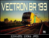
    Pic 1)
    This train is more modern and quite tall, so I went for a modern font. The font is Orbitron and the C, R, and O resemble the shape of the cab. I added more sky, so I could stretch the font until the C had similar dimensions to the cab itself.
    The BR 193 may well need making bigger or fatter, or different font altogether, depending on how important it needs to be. I placed it behind the front of the train and off the tracks to give the train an unimpeded run through the picture.

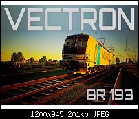
    Pic 2)
    Font is EurostileTBlaExt, which is a fatter. more squat font that makes the train look taller.
    I gave the BR 193 a stretch lengthwise to box in the train and block the tracks to make it look static.

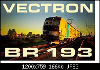
    Pic 3)
    Probably the one I would use. The image is clean, sharp and simple. I think a single, straight line of text, using a bold font is all it really needs. It also allows the 'PC' logo to be placed in the bottom right corner, where you originally had it.
    Click image for larger version. 

Name:	Pic 1.jpg 
Views:	60 
Size:	200.6 KB 
ID:	134595 Click image for larger version. 

Name:	Pic 2.jpg 
Views:	63 
Size:	166.4 KB 
ID:	134596 Click image for larger version. 

Name:	Pic 3.jpg 
Views:	64 
Size:	192.5 KB 
ID:	134597

    >>> Spectra Vectron.xar <<<

  6. #6
    Join Date
    Feb 2023
    Location
    USA, NJ
    Posts
    37

    Default Re: Never tried Green Screen ie;Chroma Key

    Quote Originally Posted by Chris M View Post
    Obligatory, my opinion only.

    Pic 1)
    This train is more modern and quite tall, so I went for a modern font. The font is Orbitron and the C, R, and O resemble the shape of the cab. I added more sky, so I could stretch the font until the C had similar dimensions to the cab itself.
    The BR 193 may well need making bigger or fatter, or different font altogether, depending on how important it needs to be. I placed it behind the front of the train and off the tracks to give the train an unimpeded run through the picture.

    Pic 2)
    Font is EurostileTBlaExt, which is a fatter. more squat font that makes the train look taller.
    I gave the BR 193 a stretch lengthwise to box in the train and block the tracks to make it look static.

    Pic 3)
    Probably the one I would use. The image is clean, sharp and simple. I think a single, straight line of text, using a bold font is all it really needs. It also allows the 'PC' logo to be placed in the bottom right corner, where you originally had it.
    Click image for larger version. 

Name:	Pic 1.jpg 
Views:	60 
Size:	200.6 KB 
ID:	134595 Click image for larger version. 

Name:	Pic 2.jpg 
Views:	63 
Size:	166.4 KB 
ID:	134596 Click image for larger version. 

Name:	Pic 3.jpg 
Views:	64 
Size:	192.5 KB 
ID:	134597

    >>> Spectra Vectron.xar <<<

    These look awesome and I'll definitely be putting these tips into effect in the future! Thanks for all the help and the all the tips, greatly appreciate all of it!


Tags for this Thread

Bookmarks

Posting Permissions

  • You may not post new threads
  • You may not post replies
  • You may not post attachments
  • You may not edit your posts
  •