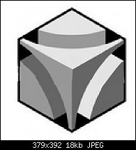
Here's something to do with the textures. In the file there's a completed design, and at the right is what I started with. I made a copy of the design to put on top of the textured drawing and then used Multiply transparency to shade the design.
Anyone want to try this? I skewed the textures in an attempt to make the texture look compatible with the angles of the design.
I'll bet anyone can do better, and if this is of interest to you, I have about 19 other different designs based on an isometric view of a cube.
Heck, these might even make good icons, no?
My Best,
Gary


 Reply With Quote


Bookmarks