Welcome to TalkGraphics.com
Page 1 of 2 12 LastLast
Results 1 to 10 of 11
  1. #1
    Join Date
    Apr 2003
    Location
    Nederland
    Posts
    368

    xdp6 How to avoid thin lines between parallel paths

    When you create shapes that fits together, there appeares a thin line that also shows when you make a jpeg from it. I'm a vector contributor at iStock and making a preview jpg with all those white lines looks really ugly (see attachment).
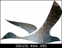
    Click image for larger version. 

Name:	goose.jpg 
Views:	255 
Size:	39.9 KB 
ID:	100271
    For anyone that struggles with the same issue here is a simple solution. Copy your shapes on top of each other and the lines are gone. This way your work stays 100% vector.
    For work that hasn't to be 100% vector, you could make a bitmap copy and place it under your vector image.

    Good luck,

    Jolande

  2. #2
    Join Date
    Apr 2011
    Location
    Hungary, Poland
    Posts
    1,265

    Default Re: How to avoid thin lines between parallel paths

    Jolande thanks for the tip that is common issue, but translating the 'Copy your shapes on top of each other and the lines are gone' to Xara tools, how do you mean that exactly?

    Is it 1) selecting all shapes, 2) group, 3) clone, 4) Add shapes, 5) Sending the clone back? Or maybe you applied some different steps

  3. #3
    Join Date
    Apr 2003
    Location
    Nederland
    Posts
    368

    Default Re: How to avoid thin lines between parallel paths

    Just select and clone them. When the two are on top of each other the lines will dissapear. Grouping them isn't necessary but for editing purposes easier.

  4. #4

    Default Re: How to avoid thin lines between parallel paths

    Quote Originally Posted by joto View Post
    Just select and clone them. When the two are on top of each other the lines will dissapear. Grouping them isn't necessary but for editing purposes easier.
    Jolande,
    I've missed your contributions here. So nice to see you posting. Thanks for the work around, too!
    R_o_n _a_l _d __C. __D_u_k_e

    x a r a . c o m..a r t i s t s ..g a l l e r y

    Xara's Facebook

    Xara Designer Pro X 16, Xara 3D7 Web Designer

  5. #5

    Default Re: How to avoid thin lines between parallel paths

    Can you show us the after image? How exactly do you get this facet effect? The profile reminds me of an experiment involving chicks that react differently to that shape depending on the direction (hawk vs. goose).

  6. #6

    Default Re: How to avoid thin lines between parallel paths

    Good tip, dankje!

    And as a sidenote; I scrolled through your website. Kuddo's for your illustrations. It shows what Xara is up to. You should send them in for artist of the month. (Gary, do we still do that?)
    Last edited by Michael; 17 January 2014 at 07:28 AM. Reason: spelling mistake

  7. #7
    Join Date
    Apr 2003
    Location
    Nederland
    Posts
    368

    Default Re: How to avoid thin lines between parallel paths

    Here's the end result.....
    The image is made using scriptographer in (sorry, I don't mean to swear ) Illustrator. You create a grid and place it on top of a raster image. Each shape is filled with the avererage color beneath it.

    @ Michael: I participated in the artist group show, years back.

  8. #8
    Join Date
    Mar 2004
    Location
    Melbourne, Australia
    Posts
    268

    Default Re: How to avoid thin lines between parallel paths

    Joto,

    Exquisite work in your site.

    Jim

  9. #9
    Join Date
    Jun 2002
    Location
    Dunoon, Scotland
    Posts
    4,778

    Default Re: How to avoid thin lines between parallel paths

    Like Jim, Joto, I like your site clean and simple and your work is great. Do you make much money out of stock vectors as I never could. Found that T shirts made the most but that's when I was freelance not now.
    Design is thinking made visual.

  10. #10
    Join Date
    Apr 2003
    Location
    Nederland
    Posts
    368

    Default Re: How to avoid thin lines between parallel paths

    I've made decent money on iStock but the last years is getting less and less.

    I saw that I forgot the attachment to show the result. So here it is......
    Attached Thumbnails Attached Thumbnails Click image for larger version. 

Name:	bird optimized.jpg 
Views:	128 
Size:	11.1 KB 
ID:	100339  


Bookmarks

Posting Permissions

  • You may not post new threads
  • You may not post replies
  • You may not post attachments
  • You may not edit your posts
  •