Nothing as good as mwenz Gary, just used the planer shapes pic to practice more with the mould tool.
Stygg

 Member
Nothing as good as mwenz Gary, just used the planer shapes pic to practice more with the mould tool.
Stygg
 Super Moderator
Bernie, Mike, stygg, all excellent and imaginative examples!
Stygg, you want to lose the "drop shadow" behind the red letters. They confuse the viewer's eye mostly because they don't represent the lighting angle in the image...they fight it.
Rik, would you like to try to show us all how the PMS, and L letters might look extruded, or pushed into, the dodecahedron?
You're good at this sort of stuff!
Well done, all around!
Thanks for contributing!
Gary
 Member
Had fun playing with the perspectives in this picture. I used some of Angelize's decorative curves on the Xone billboard. The banner is a bit too bright but I did not want to redo the whole thing. Thanks for the tut, Gare.
 Member
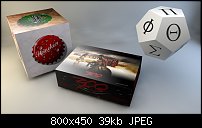
and here's one from me
bottle caps and bloody murderous slaughter
all in the space of an afternoon
must be a slow day...
If someone tried to make me dig my own grave I would say No.
They're going to kill me anyway and I'd love to die the way I lived:
Avoiding Manual Labour.
Member
Changed the letters to extrudes, not very good I'm afraid so come on Rik your a master at this sort of work, show us how it's done.
Stygg
 Member
And here is my attempt at adding 3D text.
Some wishes for this. I cannot get predictable results picking color off another object when setting the fill, line or light colors. They always need adjusted, unlike 2D objects.
Member
good attempt mike
If someone tried to make me dig my own grave I would say No.
They're going to kill me anyway and I'd love to die the way I lived:
Avoiding Manual Labour.
Super Moderator
You're welcome and except for the sticker on the car being too bright, you did some magnificent stuff, both creatively and technically in the image.Originally Posted by Boy

In fact, the banner you did gives me an idea for the Tips and Tricks for August: how to put text on wafting fabric.
There is a way I've discovered that is fairly simple and very effective.
Well done, boy.
My Best,
Gary
Member
Thanks for the positive feedback, Gare.
Looking forward to the next tips & tricks.
 Posting Permissions


 Reply With Quote

Bookmarks