Thanks Larry.
I have found that some of the punctuation period, comma etc is below the baseline which doesn't look right. So far I have found period, comma, semi colon, colon. there could well be more.


 Member
Thanks Larry.
I have found that some of the punctuation period, comma etc is below the baseline which doesn't look right. So far I have found period, comma, semi colon, colon. there could well be more.
[SIGPIC][/SIGPIC]
My current Xara software: Designer Pro 365 12.6
Good Morning Sunshine.ca | Good Morning Sunshine Online(a weekly humorous publication created with XDP and exported as a web document) | Angelize Online resource shop | My Video Tutorials | My DropBox |
Autocorrect: It can be your worst enema.
 Super Moderator
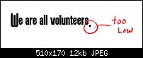
Best of luck correcting this, Frances, because the period aligns perfectly with the uppercase characters.
Okay, if we assume that a period comes at the end of a sentence, chances are good that the preceding character will be lowercase, right?
The overall problem is that the UC and the lc share different baselines.
Tell you what: if you come to an agreement here, it would be fairly easy for me to correct the punctuation relative to lowercase. I'll do the period, comma, colon and semicolon right now and you see what else is wonky.
-g-
 Moderator Posthumous
I, Bill Taylor as a contributor to the project undertaken by a group in the TalkGraphics.com Fonts and Typography Forum, to create the following fonts, RoundHeadTG. otf and RoundHeadTG.ttf, grant a perpetual, worldwide, non-exclusive, no-charge, royalty-free, irrevocable copyright license to reproduce, prepare derivative works of, publicly display, publicly perform, sublicense, and distribute the Contributions I made to the work and such derivative works.
I understand that this is a license agreement only; it does not transfer copyright ownership and does not change my rights to use the artwork I contributed for any other purpose.
Bill Taylor, United States of America
Soquili
a.k.a. Bill Taylor
Bill is no longer with us. He died on 10 Dec 2012. We remember him always.
My TG Album
Last XaReg update
Moderator Posthumous
I'm still a bit under the weather and my mind isn't working very well (not that unusual for me).
How would we classify this font? It is not a decorative font as the Celebrated Burgeon Ornaments TG font.
Soquili
a.k.a. Bill Taylor
Bill is no longer with us. He died on 10 Dec 2012. We remember him always.
My TG Album
Last XaReg update
Super Moderator
An antique sans serif headline font?
-g-
Member
That sounds good to me Gary.
The exclamation mark and the question mark again don't look quite right with the lower case letters, how ever they do look fine with the UC. Not sure if this one is fixable? Unless lowercase friendly versions could be mapped to un-used spots?
single and double quotes seem a little too high for lowercase letters, would these be better aligned to lower case? On this one I'm not sure
[SIGPIC][/SIGPIC]
My current Xara software: Designer Pro 365 12.6
Good Morning Sunshine.ca | Good Morning Sunshine Online(a weekly humorous publication created with XDP and exported as a web document) | Angelize Online resource shop | My Video Tutorials | My DropBox |
Autocorrect: It can be your worst enema.
 Member
Want all of my 30-seconds of thought on the baseline alignment issue? Seeing how I cannot hear the screams of No!, here tis.
I don't know whether there is actually a single baseline but the LC characters are raised above it, or if the UC are lowered from the font's baseline, or ? So take the following as it is: comments from a place of ignorance concerning this font's construction.
If I were making this font, I would place all LC letters on the font's baseline. I would align all punctuation in relation to the LC characters.
But here is where I don't know how the two "baselines" were incorporated. I would opt to have the UC characters' bottoms align near (or at) the descender location.
Now resuming my hiding...Mike
Super Moderator
Can we see an example, Mike?Originally Posted by mwenz

Can you tear up a line of text in Xara, using the baseline adjustments?
-g-
Member
Hi Gary,
Actually, I *thought* what I was suggesting was what you are showing in the image you added--we might have been responding at the same time:
http://www.talkgraphics.com/attachme...1&d=1335736754
Take care, Mike
Super Moderator
Okay, got it.
If anyone/everyone can chill for 24 hours, I'll align the cap heights to the character heights, and then see how the punctuations fall.
-g-
 Posting Permissions

 Reply With Quote

Bookmarks