Here in the U.K we have carboot sales, where you can buy just about anything, well nothing illegal that is.
Stygg

 Member
Here in the U.K we have carboot sales, where you can buy just about anything, well nothing illegal that is.
Stygg
 Super Moderator
Gosh, you have a fast getaway car with the loot in the trunk, and Carboot Sales don't have anything illegal?
stygg, you got main point, and then secondary point staged beautifully, but it's not a selling composition yet. Reconsider how small the rest of the text is? Balance? Larger, condensed font?
Also, this would be a color print? You have white, teal, and black. Couldn't you print black on teal and eliminate the white?
Just my 2 pence. Outstanding work very quickly, stygg!
-g-
Member
Just tried the black on teal and it looks really good, but not to sure about leaving the background white, it's a bit difficult to choose a background colour to go well with teal and black, have a look and suggest, if you don't mind Gary.
Stygg
Super Moderator
Hi stygg—
Using a color, in a production sense—real printing, not designing for the screen—means paper color. IOW, you only have the luxury, unless you want to spend £££££££ advertising an event that's by it's nature a cheap one, to print solid black on whatever paper stock you can use.
This is why I recommended in the video that you buy some fluorescent paper (neon, Day-Glow, they sell Astrobrite's at out local tech/business supply store). Because you're not going to print this in full colour...it's too expensive to do it commercially for this sort of event, and you can't/don't want to use an inkjet, because you KNOW it will rain the day before and the inkjet prints will run.
I'd like to to give this another go, please, stygg. You were at a disadvantage because you thought you could use more than one colour.
Strip the info down to the essentials—you have tow "selling" lines when you only need one in the Xara file, and play with the text. Pretend you have snippets of text on a physical piece of cardboard on the kitchen table. Shuffle the pieces around. Then take into account that in Xara you can scale text, something you can't do with printed text.
This is truly a design challenge, and also an advertising challenge.
The fewest words, the most attention-getting design.
The winner gets a lawn flamingo.
-g-
Member
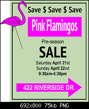
I've gone straight for the jugular, big and bold no frills, in yer face, if that does'nt catch your eye well, I'll unload all the loot from the car
Stygg
Super Moderator
@ Larry—Silly as the sign is, you're pretty much there.
@Stygg—
The following is a general criticism, and I've marked up your design somewhat, but please do not take this as a personal criticism, okay? It's truly not. I feel from the feedback here that I need to teach some more stuff about dtp, page layout, and such. That the sign tutorial didn't hit all the points. This is me learning to teach better from everyone's input, and it's just as valuable as what members learn from the tute itself.
First, in dtp, there's something called page color. If it's too dense, it gives the reader a headache eventually, and if it's too light and spindly, it makes it difficult for you eye to follow from word to word. In both cases, the page color fails. This page color thing applies to short text outdoor signs, too. You achieve page color by 1.)choice of font (bold, condensed, serif or sans serif, and so on...see our tg Fonts & Typography forum for invaluable details on this stuff), 2.) Size of font, 3.) leading—the space between lines of text, and Xara has the feature up on the Infobar to tighten and loosen leading.
So what does page color (or density) look like in a successful and unsuccessful sign? Sorta like this:
Stygg, what I'm missing from your sign is 2% organization, 3% innovation, but other than that, you're real close.
Here's what I did to and for the sign, and I'll explain below the whys:
1.) You needed to disproportionately scale your headline and the sales point inside the arrow to make the density of the elements more artistic and fit within the overall design better. Unusually, I discourage designers from dragging on text every which way, but sans serif typefaces can withstand distortion better than a serif font such as Times New Roman. The viewer's eye doesn't immediately tell them, "Oh, the designer screwed up that typeface!" with sans serifs than it does serif fonts.
2.) I see running Pound Sterling symbols across the top as a waste of message space, and I'd say the same of $$$$$ across the top. Perhaps as an artistic border, but my original garage sale sign said "SAVE" across the top, and actual message, not just a suggestion that the even involves dollars.
My version adheres closely to the original garage sale sign, but you see what I did? I made the top of the reversed out headline into a bunch of tyre treads. And played on the fact that a Pound Sterling symbol looks a little like and "L", in the same way we Yanks use a dollar sign instead of an "s" in advertising. $ALE!
++++++++++++++++++++
This is for everyone, I'm not picking on stygg, please everyone read and understand this:
There are cardinal sins committed every day with signs, that has to do with punctuation and grammar:
• The use of several exclamation marks suggests that if the business owner shouts loudly enough, someone will buy the product. One exclamation mark is sufficient for stressing a message; often a headline is adequately emphasized with no exclamation at all. It is redundant to cast a headline in all caps followed by several exclamation marks.
• The use of quotes is for quotations, not for emphasizing a phrase. When a designer puts quotation marks around “BEST” , it creates in the reader’s mind the suggestion that the retailer is speaking euphemistically. For example, when someone writes, “Get that ‘antique’ out of my parking lot in 15 minutes,” they aren’t actually referring to your 10-year-old car as a valuable antique, but rather as a piece of junk to which they’re referring euphemistically or sarcastically. The word “BEST” in quotes will surely be interpreted by anyone with writing skills as, “They really aren’t the best deals; they mean something else.”
• An apostrophe, as far as I know, is only used on three occasions. 1.) When making a contraction out of two words, as used in Don’t run with the scissors and It’s silly to dance with an alligator. 2.) When describing the possessive state of an object, idea, or whatever, as in Gary’s post, Larry’s flamingo, and so on. 3.) When you drop a character from a word, example: Nothin’ to it! An apostrophe is not used to separate two characters, and it should not be used reflexively to separate the second-to-last character and an “s” that follows.
Don't sell yourself short and don't make yourself look less intelligent than you are in print.
Sermon for today :)
Gare
Last edited by Gare; 18 April 2012 at 03:19 PM.
Member
Cheers Gary for all that information and images. I never knew or relized, just what makes or breaks something so mundane as a poster, you sort of think throw a few lines together and it will do but not the case I am finding out. There's more to it than I thought. I must admit I don't use text or fonts very much but it seems I should brush up on these and also get some fonts you mentioned in the vid. and in your postings. I've downloaded your xar file and Jpeg images, time to get some learning done.
Stygg
 Moderator Posthumous
Just kidding!
I'm pretty sure you won't like the OOB part, but otherwise I think I get the idea. Well at least I paid attention.
Larry a.k.a wizard509
Never give up. You will never fail, but you may find a lot of ways that don't work.
Super Moderator
I'm going to take everyone's colors away from them, Wizard!
The tutorial is based around a (goofy, but) real-world assignment: to make an oversized sign for some sort of event.
I like the flamingo sale, Larry.
And you used pink, black, and mint on a white paper.
That's three colors, man, and if you did spot color you'd pay a fortune to get the sign printed. You'd need to use SWOP 4C to make the sign affordable to print.
I'm truly not out to bust anyone; but the tutorial is start to finish about printing an affordable sign yourself, with tiling pages, assembled in your garage.
You resources dictate what you can do here.
Color is not part of the design, or the message.
My Best,
Gary
Last edited by Gare; 17 April 2012 at 09:44 PM.
 Member
Mike
 Posting Permissions


 Reply With Quote


Bookmarks