Thanks for all the feedback, everybody! Much appreciated!
I've made some adjustments, per your suggestions. What do you think?


 Member
Thanks for all the feedback, everybody! Much appreciated!
I've made some adjustments, per your suggestions. What do you think?
 Member
I'm throwing my 0% artist view behind (pun intended) Boy's suggestion.
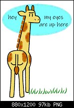
The point is the G's rear, and as such, is more prominent when it's centre stage. The lack of a mane looks cleaner. The eye slides smoothly from bottom to top, proving the funny quip.
 Member
that's an improvement TC, maybe soft-pedal the grass a bit...
that said, I think tail centre stage is good .. maybe just alter the text layout after all, so the width can be pulled in
it is as important to get the tail centered vertically as well as horizontally - not dead centre, because that can look forced, but close so it draws the eye
I'm thinking emphasise the word here making it level with the eyes ? and maybe a ! not sure... I havn't time to seek out the font...
no speech baloon for me, personally I hate speech baloons, so maybe a heavier font ? but no reason not to put a baloon back in if you luvs 'em...
there is now white space at the bottom [foreground] which to preserve visually would need a box outline - could put in some more grass but i would avoid the temptation - white space that is a margin is nowhere near as distracting as a block of white space within the actual art boundary, and psychologically, white space in the foreground is understood to be open ground, and it keeps the tail close to vertical centre
-------------------------------
Nothing lasts forever...
Member
Thanks again, everyone!
This is the final version of the giraffe image. Someone told me at another site that the grass looked like "letters with the bottom cut off", but I think I'm going to disregard that.
I've entitled the image "Cheeky Giraffe".
Thanks again for your feedback!
 Member
 Posting Permissions

 Reply With Quote
Bookmarks