Ian,
The main song menu might be better in a grid format for your mobile variant. I would be conscious too that the mobile font size IMO should be at least 20px. Text styles across variants is really useful here (e.g. Normal text desktop might be say 16px whereas you can set Normal text in the mobile variant to be say 20px).
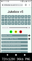
The attached screenshot is from an AV demo (still WIP); it was derived through a piece of work earlier this year on audio plugins.
 https://initiostar.co.uk/demo/JukeBoxv5/
In the demo only letters A & B are active, A has the option of immediately highlighting additional info about the song, where as B provides an info popup as an option.
Maybe some ideas to think about - 300 hundred pages in a shed-load of work; I would get the basic mobile framework sorted and tested on real devices, Android and iOS, before you plough on - best done entirely on a test site.
Gary


Originally Posted by IanB


 Reply With Quote


Bookmarks