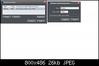
Hi. I make my mobile variant 400px (displays up to 760px) as I know it will display well on all phones and small tablets. When I made the variant using the default 480 there was invariably a bunch of problems, including displaying on my ipad as a mobile variant down the middle of the screen.
I make the desktop site first, then create the mobile variant in the web properties box. Of course once created, the elements from the desktop site do not fit, so I select all the elements on the mobile variant before I resize them, and choose stop sharing with variants. The first thing to do is then pull down the page on the mobile variant and make it really long so that you can then shuffle all the mobile elements around to fit and delete superfluous stuff that is fine for the desktop but not for the mobile. I have found this is the best way for me to avoid problems such as cut off/run-off text, images cut off, etc, and it avoids problems when you resize the mobile elements and do not want the desktop elements to change - and vice versa (which should not happen but it does). I also found that instead of using text boxes, I just use text lines on the variant, and this eliminates all the obvious problems that can happen with text on the mobile variant. Perhaps also on the mobile variant uncheck the Push properties on all the elements and text to stop them pushing other elements. I found it makes it easier to edit the mobile variant. Sounds fiddly, but once you get the hang of it, creating each mobile page is quite quick.


 Reply With Quote

Bookmarks