This is about as large as I can go with the photo because the bottom corner is reserved for publisher/endorser logos. I agree that with more of the bike shwoing, Greg is no longer floating in space.


 Member
This is about as large as I can go with the photo because the bottom corner is reserved for publisher/endorser logos. I agree that with more of the bike shwoing, Greg is no longer floating in space.
Last edited by WildRice; 15 February 2015 at 09:11 PM.
 Moderator Emeritus
Better.
Gary W. Priester
Mr. Moderator Emeritus Dude, Sir
gwpriester.com | eyetricks-3d-stereograms.com | eyeTricks on Facebook | eyeTricks on YouTube | eyeTricks on Instagram
 Member
I would also deal with the font used.
While the tech/sci-fi feel of the typeface is likely OK for the title, and perhaps the subtitle--though I might see what italicizing it is like or slanting it if there is no real italics in that font)--you should try something else for the authors' names.
 Member
I wish I had the skill to put up a better offering, but the shadowed text, colour pallet and no clear focus all lead to a confused cover with all of the elements competing for attention.
I'd try and make the cover less busy and make the title most prominent and at least stand clear of the background.
I've had a very poor attempt using your existing cover.
Member
I missed the original comment about the bottom right corner.
Member
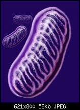
Here is just the background mitochondria for you to work with, fade and no fade. The formatting is not a free for all. The title goes on top with the subtitle just under the main title. There must be room in the bottom right hand corner for the publisher's logo and endorser's logo.
Member
I've just deleted my example!
I wasn't intending on doing the design for you, just suggesting a way to go.
To be honest, the mitochondria is a bit difficullt makes me think of something else if I'm not careful.
Paul
Member
Instead of fading the edges of the picture, you could also make the image duotone and with purple tint it would not pop out from the background too much.
Something like this.
 Posting Permissions

 Reply With Quote
Bookmarks