Rik, I like no.2 and no.5Originally Posted by Rik


Rik, I like no.2 and no.5

 Super Moderator
Thanks James.
Your feedback is really appreciated.
If I can give you some feedback, in return?!
I like the idea you have and the artwork of the axe and feather is brilliant.
The only problem I have is that The 'X' does not form part of the word 'XART'
So, when you look, all you can see is the word 'ART'
My comments are meant as feedback, and not criticism.
Featured Artist on Xara Xone . May 2011
. A Shield . My First Tutorial
. Bottle Cap . My Second Tutorial on Xara Xone
Hi Rik, I see what you mean
Member
Another idea.
 Super Moderator
Please Stop designing and read this first!
Im not going to be thanked for this, but largely you folks are spinning your wheels and using your time to design layouts and artwork that are not a logo for XaRT.
If you havent worked at an ad agency, or a commercial printer, or if youre not Gary Priester (who's been doing commercial logos for decades), you probably cannot define, and hence design a Logo.
These submissions are great and inspired artwork, but they are not logos and they are not logotypes. Let me define here:
A logo is an identifying graphic, which may or may not require additional text to make it clear who the company it and what it does. For example, Apple, Inc. uses the highly-recognizable stencil of an apple with a bite missing. Apple is often confident enough of their logo that they dont need to spell it out and no text accompanies the logo. McDonalds hedges (but might not need to) by integrating the company name with the golden arch silhouette logo; Dolby Systems and Arm & Hammer use a distinguishing graphic as their logo.
A logotype spells out the name of a company or product by customizing text with a simple graphic, or occasionally not using a graphic at all, but instead the logotype is basically a typeface commissioned for exclusive use. Google is a perfect example of a corporate logotype: Catull, a Roman serif font from the Berthold type foundry is used to identify the Web giant. Microsoft used Helvetica Black Italic for almost two decades as their logotype, with that tiny notch missing from the second o. Perhaps the most highly recognizable logotype is Walter E. Disney Enterprises, the hand script opens Disney films. Alternatively, Disney uses the mouse ear silhouette as a logo on several of their retail items.
If you can say it with a picture, text becomes subordinate and you need to ask yourself whether the text is really necessary. Today, we live by icons: icons are internationally understood and if a product or company lends itself to the visual gestalt of depicting exactly what a company does instead of using text, youll well on your way to designing a terrific logo.
Whatever Grace decides on from these submissions, we really need to do her a service by creating a logo that is descriptive, attractive, and catchyit should have a visual hook. Heres a mock example of the logo creation process: Lost Coral Antiques in Boca Raton, Florida. The small business is seafaring in flavor, so working a ships wheel as the o in Lost is appropriate, and besides, I see ship wheels for sale in antique stores by the ocean all the time. First, you design something in black and white, to see how it will look when printed on paper. One color logos are a pure art form: there is no escaping whether the design works or not when you remove color.
Then you see how it works in color. I used (appropriate) Floridian colors, the salmon and contrasting grass green, but other schemes certainly are worth a try. Then I embellished it, as it might appear in full color ads without products or anything else. This might work in the store front window, but always, the logo is the predominant element. The seahorse in both versions is subordinate, it complements the logo, as does the seaweed. They help complete the picture, but they are not the picture. Please "get" the idea of this graphic and not how it could be improved. I worked in haste here!
If you go to the "Creating a Logo" tutorial, I did an introduction to designing a logo on the March 2012 Xara Xone video tutorial. Just watch the first 3 minutes, youll get a better idea of successful and unsuccessful logos.
And I think weve submitted enough logos with a horse, and please take this observation as constructive criticism: a critical evaluation of the XaRT logoand you know that the Art Critics that occasionally troll around here will be criticalsays that the horse is actually Bill Taylors logo and not strictly the XaRT logo, okay? If Apple, Inc. used a wine glass as a logo because Steve Jobs liked wine youd never know what the company is at a glance. Be representative of what the product is, not how we want to remember Bill. Grace and other contributors are doing an earnest service to the memory of our friend by building this utility. Im sure there will be room on the Help menu for a written and graphical tribute, which is sort of where a stallion image is appropriate.
To jump start a new and more appropriate avenue of graphics here, think of what this thing is: it's a tool. How can immediately identifiable tools work with text? A wrench turning a registry entry, or one of the characters in XaRT? It's a Registry tool. What's in the Registry? A lot of numbers and values. Can you use a whole shipload of characters and numbers to make a texture within the XaRT lettering? These ideas have been done many times before; you judge whether you want to revisit this motifs, but do understand that they are immediately identifiable as the graphic foundation of what the product or idea is.
Im sorry for the length of this, but I felt strongly (because I am not entering this competition) that everyone needs to begin with a clear assignment... and many of us, for decades, have been approaching logos as a spectator and not a creator. We cant always learn by example; you should see how I worked on our car just because I know what a car looks like.
Our car makes a great paperweight now.
My Best,
Gary
Member
I would just like to add that we need something that will work well on the splash screen, as an icon and a favicon(possibly). And we may give thoughts to a background to the input(form) pages. So, as Gary said, I don't think any of you are close yet. But we have plenty of time - Steve and I are only just getting started on the design document. So don't go rushing things.
 Member
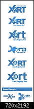
Well, here are a few starters from me.
I will take into account - Icon/Favicon next go round.
Everyone..!
Feel free to use/better any concept elements from any designs I submit. I don't feel this should be a competition, but, more of a gathering of creative minds.
I don't post a lot, but do know, I am always visiting here for ideas or solutions to a problem I may have.
Regards,
mindseye.
 Member
logo submission
 Member
Here I am, finally. fixing up the place took a while.
but here my xartwork.
be aware, not to become a ware.
Member
.
be aware, not to become a ware.
 Posting Permissions


Bookmarks