Welcome to TalkGraphics.com
Results 1 to 10 of 61

Hybrid View

  1. #1
    Join Date
    Dec 2007
    Location
    Sunshine Coast BC, Canada. In a beautiful part of BC's temperate rainforest
    Posts
    9,864

    Default Re: The April 2012 Tutorial Discussion

    Well It's definitely working now (or maybe I know the magic word! ) ) Very enjoyable Gary, I never noticed the tiling option in Acrobat Reader before so I have learned something already!

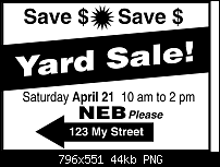
    Here is a sign layout I put together. I included a line that is often included on Yard or Garage Sale signs around here NEB (No Early Birds) or seriously the ardent yard sale junkies would be camped on your doorstep while you are still in your PJs!

    I'm not a huge fan of pink flamingos either, tell you what Barbara, I'll distract him in the Typography forum while you make it disappear!

    Click image for larger version. 

Name:	yardsale.png 
Views:	300 
Size:	44.0 KB 
ID:	88834
    Last edited by angelize; 17 April 2012 at 01:21 AM. Reason: clicked wrong button
    [SIGPIC][/SIGPIC]
    My current Xara software: Designer Pro 365 12.6

    Good Morning Sunshine.ca | Good Morning Sunshine Online(a weekly humorous publication created with XDP and exported as a web document) | Angelize Online resource shop | My Video Tutorials | My DropBox |
    Autocorrect: It can be your worst enema.

  2. #2

    Default Re: The April 2012 Tutorial Discussion

    Love the slanted and reversed text, not so much the bullet between the Save text. I would stretch the backend of the arrow past the end of the italicized Please to balance out the arrow.

    Hah, we always go early even to NEB designated sales...

    Mike

  3. #3
    Join Date
    Dec 2007
    Location
    Sunshine Coast BC, Canada. In a beautiful part of BC's temperate rainforest
    Posts
    9,864

    Default Re: The April 2012 Tutorial Discussion

    But that bullet drew your attention didn't it You are right however about the back end of the arrow (that was sloppy of me)
    [SIGPIC][/SIGPIC]
    My current Xara software: Designer Pro 365 12.6

    Good Morning Sunshine.ca | Good Morning Sunshine Online(a weekly humorous publication created with XDP and exported as a web document) | Angelize Online resource shop | My Video Tutorials | My DropBox |
    Autocorrect: It can be your worst enema.

  4. #4
    Join Date
    Feb 2006
    Location
    The Netherlands
    Posts
    2,675

    Default Re: The April 2012 Tutorial Discussion

    The good thing about ugly stuff in your yard is, that no-one will steal it.

    And here is my add, we don`t have yard/garage sales etc here, it is basically a yearly thing
    at queensday when you are allowed to sell in the streets (without tons of permits)
    Here it is.
    Attached Thumbnails Attached Thumbnails Click image for larger version. 

Name:	koninginnedag.png 
Views:	278 
Size:	94.3 KB 
ID:	88842  
    be aware, not to become a ware.

  5. #5
    Join Date
    Oct 2002
    Location
    Liverpool, N.Y.
    Posts
    6,090

    Default Re: The April 2012 Tutorial Discussion

    @Ankhor, very well reproduced. Me, I'd have tightened the spacing, so I had more room to make the text larger, but it's a fine example overall and thanks for watching the tutorial and participating!

    The keys to effective sign-making are:

    1. Clutter-awareness. When everyone is doing the same thing, you do something different. So if everyone is doing silly signs, you do a serious one to stand out in the crowd. Similarly, if everyone is using a dried-out laundry maker to make a sign, you follow the tutorial steps and make a professional one.

    2. "Color", also called "density". Evaluate your sign from different zoom levels to see whether the average eye will be able to follow the text from a distance. Text that's crammed too tightly can't be read, and spindly text with too much air around the words is hard to follow by the average reader and they'll ignore it.

    3. Hierarchy of your message. Levels of importance: what's the most important sentence? Make it your headline through the use of font boldness and font size (and choice of font). Do you all realize why I avoided a fancy typeface? Most important=Bold and large, least important=consider not even typing it, if it's that trivial! But do use a smaller point size and lighter weight.

    4. Use position and very simple design elements to get attention. The "all sane offers..." line takes up approximately the same area as the arrow. Two messages at once, eh? And also "Save$" is small, through repetition it becomes more important visually.

    You play with the elements until you get the ideal balance.

    Barb doesn't hate plastic lawn flamingos; this was an amateur theater moment. In fact she bought several when a chain store here—Ames—closed years ago. When a neighbor does something tacky like buy a huge brightly colored playset for the yard, highly visibly, highly ugly and the kid isn't even old enough to use it at 8 months (!), The Boutons retaliate with a Flamingo Swarming, all birds facing the neighbors' house on the edge on our yard.

    We entertained the idea of a "flocking" as it's called, but couldn't think of a neighbor to flock overnight, without incurring property damage after they discover the gifters.

    I'm surprised everyone picked up on the flamingo! I try to limit myself to one piece of nonsense (okay, 20) per tutorial, and the real gag I thought was one of the garage sale items in the computer simulation:

    Click image for larger version. 

Name:	dodec.jpg 
Views:	298 
Size:	28.4 KB 
ID:	88846

    Ah, well,

    —gare

  6. #6
    Join Date
    Jan 2006
    Location
    Urmston, Manchester,England
    Posts
    2,527

    Default Re: The April 2012 Tutorial Discussion

    Here in the U.K we have carboot sales, where you can buy just about anything, well nothing illegal that is.

    Stygg
    Attached Thumbnails Attached Thumbnails Click image for larger version. 

Name:	Carboot.jpg 
Views:	158 
Size:	46.0 KB 
ID:	88853  

  7. #7
    Join Date
    Oct 2002
    Location
    Liverpool, N.Y.
    Posts
    6,090

    Default Re: The April 2012 Tutorial Discussion

    Gosh, you have a fast getaway car with the loot in the trunk, and Carboot Sales don't have anything illegal?

    stygg, you got main point, and then secondary point staged beautifully, but it's not a selling composition yet. Reconsider how small the rest of the text is? Balance? Larger, condensed font?

    Also, this would be a color print? You have white, teal, and black. Couldn't you print black on teal and eliminate the white?

    Just my 2 pence. Outstanding work very quickly, stygg!

    -g-

  8. #8
    Join Date
    Oct 2011
    Location
    The Highlands Scotland
    Posts
    350

    Default Re: The April 2012 Tutorial Discussion

    Just had to drop my version in as well. I felt that a splash of colour can add that extra dimension.
    Click image for larger version. 

Name:	Yard Sale.jpg 
Views:	160 
Size:	78.5 KB 
ID:	88985

  9. #9
    Join Date
    Oct 2011
    Location
    The Highlands Scotland
    Posts
    350

    Default Re: The April 2012 Tutorial Discussion

    Oh one other thing, always make sure there is more space at each end of the sign than there is between each word (space is a virtue, so use it). Having your text stretched out to the extremities makes it look as if it is stuck to the sides of the sign and the line of text then becomes disjointed (one of those unwritten rules of sign layout) also do not mistake sign design with sign layout they are two different things. There are many strict rules of sign layouts so one day I will post these, so for now please see attached.

    Click image for larger version. 

Name:	Yard Sale 2.jpg 
Views:	153 
Size:	44.1 KB 
ID:	88987


Bookmarks

Posting Permissions

  • You may not post new threads
  • You may not post replies
  • You may not post attachments
  • You may not edit your posts
  •