But that bullet drew your attention didn't itYou are right however about the back end of the arrow (that was sloppy of me)


 Member
But that bullet drew your attention didn't it
[SIGPIC][/SIGPIC]
My current Xara software: Designer Pro 365 12.6
Good Morning Sunshine.ca | Good Morning Sunshine Online(a weekly humorous publication created with XDP and exported as a web document) | Angelize Online resource shop | My Video Tutorials | My DropBox |
Autocorrect: It can be your worst enema.
 Member
The good thing about ugly stuff in your yard is, that no-one will steal it.
And here is my add, we don`t have yard/garage sales etc here, it is basically a yearly thing
at queensday when you are allowed to sell in the streets (without tons of permits)
Here it is.
be aware, not to become a ware.
 Super Moderator
@Ankhor, very well reproduced. Me, I'd have tightened the spacing, so I had more room to make the text larger, but it's a fine example overall and thanks for watching the tutorial and participating!
The keys to effective sign-making are:
1. Clutter-awareness. When everyone is doing the same thing, you do something different. So if everyone is doing silly signs, you do a serious one to stand out in the crowd. Similarly, if everyone is using a dried-out laundry maker to make a sign, you follow the tutorial steps and make a professional one.
2. "Color", also called "density". Evaluate your sign from different zoom levels to see whether the average eye will be able to follow the text from a distance. Text that's crammed too tightly can't be read, and spindly text with too much air around the words is hard to follow by the average reader and they'll ignore it.
3. Hierarchy of your message. Levels of importance: what's the most important sentence? Make it your headline through the use of font boldness and font size (and choice of font). Do you all realize why I avoided a fancy typeface? Most important=Bold and large, least important=consider not even typing it, if it's that trivial! But do use a smaller point size and lighter weight.
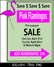
4. Use position and very simple design elements to get attention. The "all sane offers..." line takes up approximately the same area as the arrow. Two messages at once, eh? And also "Save$" is small, through repetition it becomes more important visually.
You play with the elements until you get the ideal balance.
Barb doesn't hate plastic lawn flamingos; this was an amateur theater moment. In fact she bought several when a chain store here—Ames—closed years ago. When a neighbor does something tacky like buy a huge brightly colored playset for the yard, highly visibly, highly ugly and the kid isn't even old enough to use it at 8 months (!), The Boutons retaliate with a Flamingo Swarming, all birds facing the neighbors' house on the edge on our yard.
We entertained the idea of a "flocking" as it's called, but couldn't think of a neighbor to flock overnight, without incurring property damage after they discover the gifters.
I'm surprised everyone picked up on the flamingo! I try to limit myself to one piece of nonsense (okay, 20) per tutorial, and the real gag I thought was one of the garage sale items in the computer simulation:
Ah, well,
—gare
Member
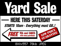
Here in the U.K we have carboot sales, where you can buy just about anything, well nothing illegal that is.
Stygg
Super Moderator
Gosh, you have a fast getaway car with the loot in the trunk, and Carboot Sales don't have anything illegal?
stygg, you got main point, and then secondary point staged beautifully, but it's not a selling composition yet. Reconsider how small the rest of the text is? Balance? Larger, condensed font?
Also, this would be a color print? You have white, teal, and black. Couldn't you print black on teal and eliminate the white?
Just my 2 pence. Outstanding work very quickly, stygg!
-g-
Member
Just tried the black on teal and it looks really good, but not to sure about leaving the background white, it's a bit difficult to choose a background colour to go well with teal and black, have a look and suggest, if you don't mind Gary.
Stygg
Super Moderator
Hi stygg—
Using a color, in a production sense—real printing, not designing for the screen—means paper color. IOW, you only have the luxury, unless you want to spend £££££££ advertising an event that's by it's nature a cheap one, to print solid black on whatever paper stock you can use.
This is why I recommended in the video that you buy some fluorescent paper (neon, Day-Glow, they sell Astrobrite's at out local tech/business supply store). Because you're not going to print this in full colour...it's too expensive to do it commercially for this sort of event, and you can't/don't want to use an inkjet, because you KNOW it will rain the day before and the inkjet prints will run.
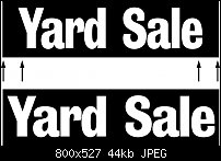
I'd like to to give this another go, please, stygg. You were at a disadvantage because you thought you could use more than one colour.
Strip the info down to the essentials—you have tow "selling" lines when you only need one in the Xara file, and play with the text. Pretend you have snippets of text on a physical piece of cardboard on the kitchen table. Shuffle the pieces around. Then take into account that in Xara you can scale text, something you can't do with printed text.
This is truly a design challenge, and also an advertising challenge.
The fewest words, the most attention-getting design.
The winner gets a lawn flamingo.
-g-
 Moderator Posthumous
Just kidding!
I'm pretty sure you won't like the OOB part, but otherwise I think I get the idea. Well at least I paid attention.
Larry a.k.a wizard509
Never give up. You will never fail, but you may find a lot of ways that don't work.
 Member
Just had to drop my version in as well. I felt that a splash of colour can add that extra dimension.
Member
Oh one other thing, always make sure there is more space at each end of the sign than there is between each word (space is a virtue, so use it). Having your text stretched out to the extremities makes it look as if it is stuck to the sides of the sign and the line of text then becomes disjointed (one of those unwritten rules of sign layout) also do not mistake sign design with sign layout they are two different things. There are many strict rules of sign layouts so one day I will post these, so for now please see attached.
 Posting Permissions

 Reply With Quote


Bookmarks