Due to some real life work "the kind that pays the bills" I won't have time to do much until late this afternoon, but the lowercase j looks good now.
Gary if you could post those panagrams they might be helpful for kicking the tires so to speak


 Member
Due to some real life work "the kind that pays the bills" I won't have time to do much until late this afternoon, but the lowercase j looks good now.
Gary if you could post those panagrams they might be helpful for kicking the tires so to speak
[SIGPIC][/SIGPIC]
My current Xara software: Designer Pro 365 12.6
Good Morning Sunshine.ca | Good Morning Sunshine Online(a weekly humorous publication created with XDP and exported as a web document) | Angelize Online resource shop | My Video Tutorials | My DropBox |
Autocorrect: It can be your worst enema.
 Moderator Posthumous
Could everyone try the fonts within the attached zip file and provide feedback, please?
Only install either the .ttf or the .otf, not both.
Last edited by angelize; 10 May 2012 at 12:20 AM. Reason: link to beta version removed
Soquili
a.k.a. Bill Taylor
Bill is no longer with us. He died on 10 Dec 2012. We remember him always.
My TG Album
Last XaReg update
 Moderator Posthumous
Bill I just looked at the font and it looks really good except I do have an issue with the capital L. To me it looks like a G so see below for my suggestion. Either one on the left is fine with me.
What does everyone else think?
Larry a.k.a wizard509
Never give up. You will never fail, but you may find a lot of ways that don't work.
 Member
Hi Larry,
The 'g' look is directly from Gare's posted bitmaps of the original here http://www.talkgraphics.com/showthre...840#post438840 We could do an alternate for it.
~Fred
Member
I have finally had a few mins to play around with the font and I agree with Larry about the Cap L but I think that the alternative on the right in the example looks better to me
Or... How about something like this?
Let me know if you want my .xar
[SIGPIC][/SIGPIC]
My current Xara software: Designer Pro 365 12.6
Good Morning Sunshine.ca | Good Morning Sunshine Online(a weekly humorous publication created with XDP and exported as a web document) | Angelize Online resource shop | My Video Tutorials | My DropBox |
Autocorrect: It can be your worst enema.
Moderator Posthumous
We can add an alternate L. Please do not submit a .xar file however, people using different relative sizes cause issues when the glyph is imported into FontLab and must be manipulated to fit in with the existing glyphs. Easier to edit an existing glyph at this point while inside FontLab.
Everyone please indicate which shape you would like, one of Larry's two choices, or Frances'.
Round Head as we have been working on it is a Head Line font. Would we like to delve deeper into font creation and have Round Head become a font family? In this case a family with two or three member fonts. Gary has done some work on a shortened Capitol letter version. I am experimenting with creating a version with typical baseline for upper case and lower case and a font weight suitable for text content rather than a headline. No new glyphs will be needed, Gary and I can work with the glyphs everyone has already provided.
What do the members of the Typography and Fonts group think about the idea?
Soquili
a.k.a. Bill Taylor
Bill is no longer with us. He died on 10 Dec 2012. We remember him always.
My TG Album
Last XaReg update
Member
I think that is a wonderful idea. I think the three fonts would be a nice family
[SIGPIC][/SIGPIC]
My current Xara software: Designer Pro 365 12.6
Good Morning Sunshine.ca | Good Morning Sunshine Online(a weekly humorous publication created with XDP and exported as a web document) | Angelize Online resource shop | My Video Tutorials | My DropBox |
Autocorrect: It can be your worst enema.
Moderator
Forget this it appears to be a Word issue the kerning varies with the different font sizes
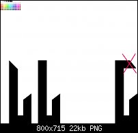
before you go too far please look at the attached text example - I think the kerning in some instances is too close and the lower case 'n' looks too tall.
Additional - this was done in Word using the OTF font at 24 points.
Christine
Last edited by Christine Farrelly; 02 May 2012 at 05:42 AM.
Moderator Posthumous
I like what Frances has shown. I wrestled with that in my sleep last night and came to the same conclusion. Frances version looks better to me, it is in keeping with the original but does not look like a G. So I vote for that one. But honestly any of the 3 (mine and Frances) would be fine with me.
ATTACH=CONFIG]89193[/ATTACH]
I also agree with Christine, the lower case n does appear too tall. I don't know if it is because of what it is next to but I certainly get that impression.
EDIT: After considering what Fred said about the J maybe we could cut back that top bar similarly to the L.

Last edited by wizard509; 02 May 2012 at 02:08 PM.
Larry a.k.a wizard509
Never give up. You will never fail, but you may find a lot of ways that don't work.
 Super Moderator
@Bill—
If you put these nonsense sentences (called pangrams) in the kerning pair drop-down, they'll help you spot problems after auto-kerning:
We took a breezy excursion and gathered jonquils from the river slopes.
Sexy diva Jennifer Lopez wasn't baking me quiche.
Just work for improved basic techniques.
Jackdaws love my big sphinx of quartz.
Schwarzkopf vexed Iraq big-time in July.
Fabled reader with jaded, roving eye seized by quickened impulse to expand budget.
Viewing quizzical extracts mixed up hefty jocks.
-g-
 Posting Permissions

 Reply With Quote

Bookmarks