Welcome to TalkGraphics.com
Results 1 to 10 of 211

Hybrid View

  1. #1
    Join Date
    Dec 2000
    Location
    Hautes Pyrénées, France
    Posts
    5,083

    Default Re: The January 2012 Tutorial Discussion

    I'm going to nit-pick. The ONLY thing I don't like about the image is the repeating tile texture which should perhaps be repeat inverted so that you don't see the lines of the tile joins:

    Click image for larger version. 

Name:	repeating_tile.jpg 
Views:	144 
Size:	83.8 KB 
ID:	86820

    But really, I'm nit-picking. It's a truly excellent study
    If someone tried to make me dig my own grave I would say No.
    They're going to kill me anyway and I'd love to die the way I lived:
    Avoiding Manual Labour.

  2. #2
    Join Date
    Jul 2008
    Location
    Montevideo, Uruguay
    Posts
    1,345

    Default Re: The January 2012 Tutorial Discussion

    Quote Originally Posted by beretgascon View Post
    I'm going to nit-pick. The ONLY thing I don't like about the image is the repeating tile texture which should perhaps be repeat inverted so that you don't see the lines of the tile joins:

    Click image for larger version. 

Name:	repeating_tile.jpg 
Views:	144 
Size:	83.8 KB 
ID:	86820

    But really, I'm nit-picking. It's a truly excellent study
    Beretgascon,
    I made a change let me know if it is better.
    Best regards
    Attached Thumbnails Attached Thumbnails Click image for larger version. 

Name:	icosaedro2.jpg 
Views:	125 
Size:	121.8 KB 
ID:	86823  
    Last edited by jvila; 22 January 2012 at 03:30 PM. Reason: attachment
    Javier

  3. #3
    Join Date
    Jan 2006
    Location
    Urmston, Manchester,England
    Posts
    2,527

    Default Re: The January 2012 Tutorial Discussion

    Quote Originally Posted by jvila View Post
    Beretgascon,
    I made a change let me know if it is better.
    Best regards
    The tile looks better but it still looks like a towering building behind that great shape, use the mould tool to alter the tile. It will appear to be sitting on the tile rather than a bout to climb it.

    Stygg
    Attached Thumbnails Attached Thumbnails Click image for larger version. 

Name:	Tile.jpg 
Views:	120 
Size:	15.2 KB 
ID:	86826  

  4. #4
    Join Date
    Jan 2006
    Location
    Urmston, Manchester,England
    Posts
    2,527

    Default Re: The January 2012 Tutorial Discussion

    Just so you can see how it would look with the tile altered, sorry I can't do those great fills as your shape has, but you can see how it would look, hope this helps

    Stygg
    Attached Thumbnails Attached Thumbnails Click image for larger version. 

Name:	22.jpg 
Views:	116 
Size:	12.7 KB 
ID:	86829  

  5. #5
    Join Date
    Oct 2002
    Location
    Liverpool, N.Y.
    Posts
    6,087

    Default Re: The January 2012 Tutorial Discussion

    Here is what I am suggesting, folks. Javier, I cannot criticize your icosahedron—it by itself is terrific.
    BUT...do we go to an art gallery and appreciate only one element of a painting? No.

    Artists need to practice composition. How do all the elements direct the viewer's eye?

    Today's bonus lesson is on how asymmetry is usually better than symmetry in a composition.

    Javier, I have taken your latest post and simplified it to show you and others how the three elements in your composition appear.

    You have a white background in back. First of all: why? White and light colors make reflections look dull. Your tiles that the icosahedron are resting on are right in the center of the white background. Why? Why should the tiles be centered so perfectly? Then your icasahedron is resting on the tiles, almost in the center of your composition.

    By making everything of almost equal size and centered, you take away from the importance of the icosahedron, which should be the star, the hero, of your composition. Look at what I did, and don't laugh because I did it so quickly.

    Obviously, the green icosahedron is the star of the composition. The tiles are second in importance and the background is nothing, it's black.
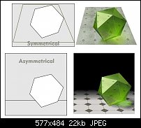
    Click image for larger version. 

Name:	symmetry-is-not-good.jpg 
Views:	116 
Size:	22.3 KB 
ID:	86830

    The lesson: let the part of your drawing that's the most important be in front, compose the picture asymmetrically so the vier's eye will go to the star of the drawing and stay there, don't let other elements be too important.

    Also, look at the perspective of the tiles in the original images I posted. Look carefully, and use the Mould tool to make a very severe angle.

    Don't let your icosahedron fall off the tiles!

    I'm attaching a XAR file with the elements. Most of them are bitmaps, sorry!

    —Gary
    Attached Files Attached Files

  6. #6
    Join Date
    Jul 2008
    Location
    Montevideo, Uruguay
    Posts
    1,345

    Default Re: The January 2012 Tutorial Discussion

    Quote Originally Posted by Gare View Post
    Here is what I am suggesting, folks. Javier, I cannot criticize your icosahedron—it by itself is terrific.
    BUT...do we go to an art gallery and appreciate only one element of a painting? No.

    Artists need to practice composition. How do all the elements direct the viewer's eye?

    Today's bonus lesson is on how asymmetry is usually better than symmetry in a composition.

    Javier, I have taken your latest post and simplified it to show you and others how the three elements in your composition appear.

    You have a white background in back. First of all: why? White and light colors make reflections look dull. Your tiles that the icosahedron are resting on are right in the center of the white background. Why? Why should the tiles be centered so perfectly? Then your icasahedron is resting on the tiles, almost in the center of your composition.

    By making everything of almost equal size and centered, you take away from the importance of the icosahedron, which should be the star, the hero, of your composition. Look at what I did, and don't laugh because I did it so quickly.

    Obviously, the green icosahedron is the star of the composition. The tiles are second in importance and the background is nothing, it's black.

    Click image for larger version. 

Name:	symmetry-is-not-good.jpg 
Views:	116 
Size:	22.3 KB 
ID:	86830

    The lesson: let the part of your drawing that's the most important be in front, compose the picture asymmetrically so the vier's eye will go to the star of the drawing and stay there, don't let other elements be too important.

    Also, look at the perspective of the tiles in the original images I posted. Look carefully, and use the Mould tool to make a very severe angle.

    Don't let your icosahedron fall off the tiles!

    I'm attaching a XAR file with the elements. Most of them are bitmaps, sorry!

    —Gary

    Gary, what can I say???, your comment is what I was expecting to, you sent the light, the artist's secret, you've showed me what it bugged me from the drawing, thank you very much, here it goes my last attempt following your advice
    Attached Thumbnails Attached Thumbnails Click image for larger version. 

Name:	icosaedro5.jpg 
Views:	89 
Size:	78.8 KB 
ID:	86834  
    Javier

  7. #7
    Join Date
    Dec 2000
    Location
    Hautes Pyrénées, France
    Posts
    5,083

    Default Re: The January 2012 Tutorial Discussion

    Magnificent - this thread just gets better and better
    If someone tried to make me dig my own grave I would say No.
    They're going to kill me anyway and I'd love to die the way I lived:
    Avoiding Manual Labour.

  8. #8
    Join Date
    Jul 2008
    Location
    Montevideo, Uruguay
    Posts
    1,345

    Default Re: The January 2012 Tutorial Discussion

    Stygg,
    Thank you very much for your recomendation, I'm uploading 2 files, the first one is modified according to your recomendation, the other one is just the object to show how the shadow is projected.
    Best regards and thank you very much
    Attached Thumbnails Attached Thumbnails Click image for larger version. 

Name:	icosaedro3.jpg 
Views:	87 
Size:	121.4 KB 
ID:	86833   Click image for larger version. 

Name:	icosaedro4.jpg 
Views:	83 
Size:	17.7 KB 
ID:	86832  

    Javier


Bookmarks

Posting Permissions

  • You may not post new threads
  • You may not post replies
  • You may not post attachments
  • You may not edit your posts
  •