This is first Logo I have done for anyone but myself, Please give opinion as I am still very much a student.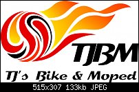


 Member
This is first Logo I have done for anyone but myself, Please give opinion as I am still very much a student.
 Moderator Posthumous
I'm not a designer but there is something about this that bothers me, I think it's the flames and the marble shape don't really go together. Just my opinion of course so don't make anything of my statement.
Larry a.k.a wizard509
Never give up. You will never fail, but you may find a lot of ways that don't work.
 Member
Okay, some critiques. Don't worry, these are things I'd tell anyone, so I'm not just being mean to you.Originally Posted by Gypsyjoe

1.) It's TJ's Bike & Moped, i.e. TJBM, but the TJBM looks like NBM, which conflicts with something else...
2.) The image then is suggested subconsciously that this is a flaming basketball and NBM might be National Basketball Museum or something else related to NBA?
3.) the apostrophe-s looks weird, the s is floating on it's own. I'm not particularly a fan of the typeface, but that's not a problem as long as you treat the type with care.
4.) Overall, when doing a logo, you want to do something that looks good in black and white before adding color and I think the image is very strong and would look great single color, but my question is 'how much does this have to do with bikes and mopeds?'
5.) Overall, it's a good starting point. My instinct is that the logo image is intended to be possibly a flaming wheel while being original enough to separate itself from similar images, but this might be too far.
Also a personal thing of mine, I'm not particularly a fan of gradients on flat images. I dunno why, but that's purely just me being strange. :P There's no rule that says you should or shouldn't do that (and as you'll learn, rules are there as guidelines, if you know what the rule is for, then you know when and when it's not okay to break it...but afaik, there's no rule on gradients!) I think the wheel/ball image is very interesting and cool, like a weird 3D flaming yin yang, but because of the type issues with NBM, it first reads as a basketball. It's not until I read the bottom line that I can decipher everything, which is not particularly desireable for branding material like this. I think even simply adding a white space so the 'T's cross bar looks long and the J looks shorter would go a long way to make this work that and that would only take a white rectangle strategically placed.
Hope that helps a little. The image looks super cool, it's the type that feels like it's not doing it's job properly here.
See my some of artwork and hear some of my music at www.kniteforcerevolution.com
Member
Thank each of you for your honest opinion, I didn't see it as you did until you mentioned it but you are right the T and J do look like a N That is easily corrected as they are so close together because I changed the kerning to put them close together I just need to widen it out a little bit so they are separate and I think that will cure that problem. As for the hanging s same thing once again simple cure. The Object of the Circle with flames was that TJ wanted flames and I thought the circle represented a wheel. I first tried to do a bike made out of flames but am just not talented enough for that, where as the circle was simple and adding a very few flames was within my limited talents. Good thing TJ isn't paying any more than a tune up on my bike or I would really be ripping him off. I will change the kerning and re upload to see what you think. As for the gradients I personally did not think the Flames looked right as a solid color and after your reply I went back and made it just black & white sorry it looks bad as far as I can see but I have to admit I am not very artistic. Once again thank you for your opinions as I find them both helpful especially the T & J being a N.
 Member
Although I'm not a fan of All caps, I think in this instance ALL CAPS would work better for the lettering. Unless there's a particular reason for that specific font, I'd also experiment with a couple of alternate fonts, and see if that makes a difference.
Keith
~~~~~~~~~~~~~~~~~~~~~~~~~~~~~~~~~~~~~~~
There are 10 types of people in this world .... Those who understand binary, and those who don't.
 Moderator Emeritus
The logo is very effective. And the font you have chosen is OK though it kind of runs together.
I would use a simpler font for the bottom line of text.
Gary W. Priester
Mr. Moderator Emeritus Dude, Sir
gwpriester.com | eyetricks-3d-stereograms.com | eyeTricks on Facebook | eyeTricks on YouTube | eyeTricks on Instagram
 Member
Everyone is talking about the text and I'm thinking the wheel needs to flow with the flames.
Member
You can also stylize the glyphs as well, i.e. keep them close together and add new ways to 'separate them', which was my personal suggestion.
See my some of artwork and hear some of my music at www.kniteforcerevolution.com
 Member
I'd be the last person to give advice on logo's, but I agree with Gary. Just that font change would make the difference. Just keep enjoying the drawing and it will all come together.
 Member
I think you did a outstanding job. Keep pushing ahead.
 Posting Permissions

 Reply With Quote
Bookmarks