I like the icon with the colors! Did you try capital letters? I wonder what it would look like.


 New Member (No PMs)
I like the icon with the colors! Did you try capital letters? I wonder what it would look like.
 Member
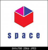
It is as others have said clean and simple and I like the use of simple geometric shapes and the extra space between letters. But this doesn't say office space to me I see space exploration, or a sci Fi movie channel.
Try swapping out the star for a cube and use a font that you would think of being used in an office environment. Perhaps something san serif.
here is a quick example of how you could use simple shapes to create a cube (yes I know its not perfect)
[SIGPIC][/SIGPIC]
My current Xara software: Designer Pro 365 12.6
Good Morning Sunshine.ca | Good Morning Sunshine Online(a weekly humorous publication created with XDP and exported as a web document) | Angelize Online resource shop | My Video Tutorials | My DropBox |
Autocorrect: It can be your worst enema.
 Member
LOL! Frances! When I was brainstorming ideas I didn't come up with your idea, wished I had because that would have been a great concept! And like I said earlier, there's no real client to bounce ideas off of or show your work to so you can get feedback. But, hey, it's free training so I'm not complaining. It's a lot of fun getting feedback from you guys! You make it seem worth while. Too bad I don't get college credit for this. But I AM making a portfolio book to put EVERYTHING in, including the briefs and my sketches. I bought a special book to keep it all in. And when I am finished with this course, in 30 days, I will be a better logo designer! Not to mention, I will also be better at AI!Originally Posted by angelize

I maybe make 10 or so logos a year (not many) but I hope to do more after this course. It's my specialty that I love. Since I didn't go to design school but I've had a couple of online design classes and a few art classes over the years but they were all pretty much "generic" courses, nothing specific. But this course is specific. It only deals with logo design. And this will be a big plus to share with potential clients in the future, especially bigger clients. I mostly do small businesses. But who knows where this can lead!
Mark
P.S...The "fictional" client suggested that I look at their competitors' websites to get a feel for the look. When I designed it I knew that this company would need help in competing with their collages in the profession. So, I designed something that looked somewhat like their (the other companies') logos but I decided that this company needed an extra "kick" to position themselves apart from the competition as a better marketing strategy. Incidentally, their competition was two REAL companies online.
P.S.S...I also learned how to use the knife and clipping mask in AI. Learn something new everyday
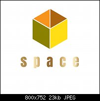
P.S.S.S...I created a new version based on Frances' recommendations:
Last edited by Mark321; 08 June 2017 at 08:28 PM.
 Member
Loose the gradient on the text.
It is (almost) OK for a web site for an effect--but still not on the logo. They are generally a poor idea for use in an identity. With the spacing in the wording, adding "space" due to the fading of the gradient is too much.
As for color, pick one from the cube and use it. Also make sure how well those differentiate if reproduced in B/W (grayscale). General tidiness of the cube would be a good idea as well.
Mike
Member
Agreed.
Member
This is my last attempt. Tomorrow is a new assignment!
Member
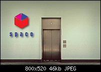
Mockup time!
Member
Assignment LOGO #2:
This logo is for a coffee shop in Seattle. There are only 5 shops so far and the company doesn't want the color "brown" in the logo, tired of seeing brown. My sketches started with the proverbial coffee mug but found it to trite for my tastes. Instead I brainstormed other associations for coffee time and came up with "strong morning coffee". So, I settled on the sun as my iconic image. It took me forever and a freakin' day to come up with the perfect font.
Impressions? I am pleased with this image and actually LOVE LOVE LOVE the ad campaign I placed the logo inside of a mockup ad. This logo has the ability to scale down and look way cool scaled way up. Cons? I took a while trying out different color schemes but decided a black-and-white color scheme fit the bill the best and it gave strong impact to the image which was in keeping with the idea of "strong coffee", which, I have, over the years, discovered most people prefer it that way (I personally don't).
So, what do you think of my design? Is it any good? Did I create an eye-catching image? You decide!
Mark
Member
Yes, Dreymel. I DID try all caps but there wasn't much difference from the small letters. The letters looked (to me) better small than large.
Mark
 Posting Permissions

 Reply With Quote

Bookmarks