
Originally Posted by
yellowbird

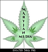
That is quite impressive for someone who doesn't have the skills to "finesse". The only thing I would consider is Maryjane. You might want to select the vertical text and center it as the J, A,N seem to have had maybe a little too much leaf. However, a slight offset on a few letters on maryjane with the straight alignment media (maybe slightly larger) on the bottom might be quite effective. I'll upload xar files I have if you wish, I don't work in this space, just love shapes and green I guess. Take seriously the professionals that give you advice here - especially logo and branding. I think you need to also indulge your creativity, tee shirt - why not?. Font selection can make a big impression, and I think you've got that nailed and I'm liking the fill. I thought about this, but probably too much, you could replace the Y in maryjane with a leaf. Not with this end layout but with animation on the way to the end display? I'd love to work with you on this a bit, but you have to realize most of my ideas on this post have been rejected I'm certain with good reason. However, a few ideas or where to find out how to do them can't hurt.


 Member
 Posting Permissions

 Reply With Quote
Bookmarks