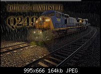
Looking at the design itself, I question whether the text suits the picture. The train is weight and power. The weather is inclement and visibility is poor. The picture, as a whole, is dark, moody and menacing.
In the first pic I made the Q249 prominent as it's short, mysterious and punchy, as in, the train IS Q249!
The second pic simply moves the text slightly behind the train, making the power and force of the train the most prominent feature.
#1 is the one I'd go with. #2 is a bit 'fussy'.


 Reply With Quote


Bookmarks