I was't eitherOriginally Posted by RKissane

.


 Moderator Posthumous
I was't either
.
Larry a.k.a wizard509
Never give up. You will never fail, but you may find a lot of ways that don't work.
 Member
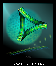
My new sci-fi op-art
 Member
Like it Igor, and it does have that scifi look.
Moderator Posthumous
I especially like this one Igor it's awesome.
Larry a.k.a wizard509
Never give up. You will never fail, but you may find a lot of ways that don't work.
Member
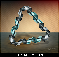
After few months new XARA Moebius strip
 Super Moderator
That is spectacular, Ivan! You should perhaps sell it to Adobe Systems for a new Acrobat logo!
After you collect all the $$$$, you can tell them you used Xara, not Illustrator to create it!

Member
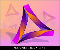
and what about this?
Makita or BOScH drill company logo
XARA only
XARA and AFFINITY
 Super Moderator
WOW.
They look amazing.
Featured Artist on Xara Xone . May 2011
. A Shield . My First Tutorial
. Bottle Cap . My Second Tutorial on Xara Xone
Super Moderator
Igor?
Affinity ___?
Designer or Paint?
Or Publisher? :O
I;m not in a good position to comment on the features you and everyone else can usebecause I own Affinity Designer and SUCK at itbut given that, I feel the "pure" Xara illustration has a "focus", and contrast and a sharpness or dramatic quality that I find inviting.
The somewhat warmer and softer illustration where you used Affinity No Idea, sort of warmly attracts you and to spend a little more time appreciating it.
If anyone trusts my opinionwhen there's little reason to!I think the quality that changed is the lighting reacting to the colors. The reason I'm pointing this out is that color palettes play a big roles in the overall reaction you want to get from the viewer.
And this goes for parts of an illustration, not just overall. If you contrast a dark metallic object with a background that is warm coloured and soft...you know where you're going to attract the viewer's eye first.
My Dad would be proud of me using my schooling :(

Member
Gary,
I was lazy to draw the same picture of spiral in Affinity Designer. I put raster of spiral triangle from Xara. I made sandy background and "gold" additing.
And what about this pure Xara pictue?
 Posting Permissions

 Reply With Quote


Bookmarks