"About us" is blank.Originally Posted by TimBox

Verity is about truth, variety is about variation.
Nothing on the resources page seems to result in a downloadable resource!


 Member
 Re: The right page sizes for proper transistions
"About us" is blank.
Verity is about truth, variety is about variation.
Nothing on the resources page seems to result in a downloadable resource!
 Member
Re: The right page sizes for proper transistions
Member
Re: The right page sizes for proper transistions
Tim,
I changed the Scale-to-fit-Width in your shared TG copy as I advised to a maximum 1200px and published it (temporarily) here as a test: https://initiostar.co.uk/demo/TB/
Appears to work in a mobile landscape format on my mobile (though not sure why someone would do this other than for a video).
For completeness:
I can't tell what you else you may have changed after you shared the file on TG; it seems to work for me, but I've not looked at anything else on your site.
Gary
Member
Re: The right page sizes for proper transistions
Following a link from "steamqualityinnovations". A very poor experience on my iPhone.
and from the https version..
Member
Re: The right page sizes for proper transistions
Paul, do you get a better experience with the test https://initiostar.co.uk/demo/TB/ ?
 Super Moderator
Re: The right page sizes for proper transistions
Super Moderator
Re: The right page sizes for proper transistions
Just from looking at the deployed site, the smaller variant has a carousel sitting off right (https://www.talkgraphics.com/attachm...7&d=1627121404) where it is cut off by Clip to page edges.
This clipping is also telling me your page width sizes are (1280, 880, 875). On the smallest variant the NavBar is far too wide.
There is no Scale to fit width applied.
You seem to have different published material in http:// & https:// presentations.
I have no interest in having to check into your design as well until you have normalised what it presently askew as indicated.
Acorn
Acorn - installed Xara software: Cloud+/Pro+ and most others back through time (to CC's Artworks). Contact for technical remediation/consultancy for your web designs.
When we provide assistance, your responses are valuable as they benefit the community. TG Nuggets you might like. Report faults: Xara Cloud+/Pro+/Magix Legacy; Xara KB & Chat
Super Moderator
Re: The right page sizes for proper transistions
Initiostar, your rendering is fully functional across Desktop browsers. I only have Android but I see two of the sizes fitting perfectly.
Acorn
When we provide assistance, your responses are valuable as they benefit the community. TG Nuggets you might like. Report faults: Xara Cloud+/Pro+/Magix Legacy; Xara KB & Chat
Member
Re: The right page sizes for proper transistions
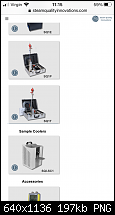
It now works as I would expect though the product page is not fit for purpose on my iPhone - product images with exclamation marks and no information.
Good job.
 Member
Re: The right page sizes for proper transistions
Member
Re: The right page sizes for proper transistions
If I hit the explanation mark (I personally think this needs to be an 'i') the information pop-up's work on my iPhone Paul. It would possibly be better if if the pop-up's weren't set to automatically close though.It now works as I would expect though the product page is not fit for purpose on my iPhone - product images with exclamation marks and no information.
Egg
Minis Forum UM780XTX AMD Ryzen7 7840HS with AMD Radeon 780M Graphics + 32 GB Ram + MSI Optix Mag321 Curv monitor + 1Tb SSD + 232 GB SSD + 250 GB SSD portable drive + ISP = BT + Web Hosting = TSO Host
Member
Re: The right page sizes for proper transistions
My initial big finger stabs at the exclamation mark did nothing, but you are right - hit it in the right place and the pop-up appears.
Right it works but from a UX perspective it really is poor.
It requires that I as a user understand that hitting a small explanation mark will give me more information, but initially I thought that the explanation mark denoted an error.
It's a really small target to hit - way smaller than is good mobile practice.
Finally.. THERE IS NO NEED TO HIDE THAT INFO IN A POPUP.
Put the info under the picture so only scrolling is required. This is why we have variants.
Egg, did you manage to download any resources?
Member
Re: The right page sizes for proper transistions
Agreed Paul. That's why I suggested an 'i' as that is a more universal symbol for information.It requires that I as a user understand that hitting a small explanation mark will give me more information, but initially I thought that the explanation mark denoted an error.
No, but I didn't expect it too. This is a draft site posted by Gary. Not even Tims site has working links at present.Egg, did you manage to download any resources?
Egg
Minis Forum UM780XTX AMD Ryzen7 7840HS with AMD Radeon 780M Graphics + 32 GB Ram + MSI Optix Mag321 Curv monitor + 1Tb SSD + 232 GB SSD + 250 GB SSD portable drive + ISP = BT + Web Hosting = TSO Host
 Posting Permissions

 Reply With Quote
Bookmarks