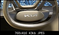
I agree and I like the logo, certainly when you see it in use.Originally Posted by gwpriester


 Member
I agree and I like the logo, certainly when you see it in use.
 Member
what I meant was making the K taller interupts the flow - Boy has posted a very good example of that visual flow in use...as a logo [not type]
-------------------------------
Nothing lasts forever...
 Member
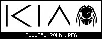
I don't like that new logo at all. As others have stated earlier it looks like a KN to me, it doesn't say KIA as the earlier one did even without the horizontal part of the A.
I think the best logo's work if they originate with text within the logo and maintain the same typeface throughout variations. Ford & CocaCola as examples. Even better logos have text and an image such that overtime the image alone can be used as a standalone logo. MacDonalds & Nike for example.
The new Kia logo reminds me of the dreadful logo used for my Amazon credit card company, NewDay.
Egg
Minis Forum UM780XTX AMD Ryzen7 7840HS with AMD Radeon 780M Graphics + 32 GB Ram + MSI Optix Mag321 Curv monitor + 1Tb SSD + 232 GB SSD + 250 GB SSD portable drive + ISP = BT + Web Hosting = TSO Host
Member
a lot more interest on the loan than in the logo
I applied for an amazon card so as to get a good discount on some kit; I sure a'int going to rack up any debt on it at over 20% apr....
-------------------------------
Nothing lasts forever...
 Member
I have no design training and spent about 30 minutes after dinner whilst nursing a brandy on this; so obviously better than a professional advertising agency
Making the i an i
Explaining the red dot symbolises something like the heart of the engine and adding $10,000 to the price of the logo.
Leaning forward because cars go forward and so does a forward thinking car company...genius...add another $10,000
The letters reminded me of the Predator glyphs. Kia Predator sounds cool.
It could be an electric car "Kia Predator, so quiet you'll never know it's there"
Member
One can even type the Predator version on a qwerty keyboard
|<|^
I'm emailing Kia. I might get a free car out of this.
Member
Kia Predator - they'll never hear you coming.
 Moderator Emeritus
Gary W. Priester
Mr. Moderator Emeritus Dude, Sir
gwpriester.com | eyetricks-3d-stereograms.com | eyeTricks on Facebook | eyeTricks on YouTube | eyeTricks on Instagram
 Member
I like that, but it's not the same as the earlier one. The lengthened joins between the letters make it much more legible. And in my opinion a much better logo.
Keith
~~~~~~~~~~~~~~~~~~~~~~~~~~~~~~~~~~~~~~~
There are 10 types of people in this world .... Those who understand binary, and those who don't.
Member
now I start to see KLA ....
and very visual yes
-------------------------------
Nothing lasts forever...
 Posting Permissions

 Reply With Quote


Bookmarks