 Re: Selections in Xara Designer Pro whatever the latest version is.
I only use Designer Pro+ in demo mode* at the moment, but also wanted to voice my concern over "the huge blue and white dotted line that makes doing anything that little bit harder than it used to be".
Here are a few other observations relating to the new look:
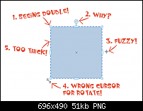
- There appears to be two selection points overlapping each other (bug?)
- I do partially understand this as Affinity Designer has a similar feature, but far more elegantly implemented, but compared with the 'old way' it doesn't add much functionality
- The centre of rotation graphic icon is blurred
- This cursor icon doesn't say rotate to me, more like skew in a straight line
- These dotted lines are too wide and get in the way of seeing edges of shapes
- Not annotated above but the side selectors icons are again unnecessary (obviously imho)
Thankfully the registry hack is available, but I'd much rather not have to delve in that deep.
*(you can't copy or save, but can paste from PGD to see what things should really look like, ie not blurry)
Jon (Jono) Xara Photo & Graphic Designer 19.0.0.64329 DL x64 May 19 2022


 Reply With Quote


 Acorn - installed Xara software: Cloud+/Pro+ and most others back through time (to CC's Artworks). Contact for technical remediation/consultancy for your web designs.

Bookmarks