Welcome to TalkGraphics.com
Results 1 to 5 of 5
  1. #1
    Join Date
    Jan 2020
    Posts
    1

    Default Navigation bar CHALLENGE

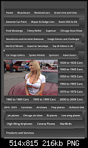
    Have a website with about 40 navigation tabs. No problem for website. Yet when I do a website variant for cell phones How Can I create an Navigation platform that looks good and still be able to provide (perhaps with drop down nav bars) a person ability to select any of the 40 tabs

    Here are two screen shots Website desktop variant and cell phone variant (with cell phone being the challenge.Click image for larger version. 
Name:	Screen Shot 2020-01-08 at 6.25.12 PM.jpg 
Views:	265 
Size:	65.2 KB 
ID:	126067Click image for larger version. 

Name:	Screen Shot 2020-01-08 at 6.23.05 PM.png 
Views:	262 
Size:	215.9 KB 
ID:	126068

  2. #2
    Join Date
    Dec 2018
    Location
    Australia
    Posts
    1,921

    Default Re: Navigation bar CHALLENGE

    I'd be breaking those links into sub-menus, even on the desktop site. Something along the lines of Cars, Aircraft, Year of Vehicle etc. The advertisers and sponsors could be detached altogether and grouped with any social media buttons, or contact buttons.

  3. #3
    Join Date
    Mar 2018
    Location
    Morelos, Mexico
    Posts
    236

    Default Re: Navigation bar CHALLENGE

    I second Chris M’s suggestion.

    It is generally recommended by “the experts” that you limit principal navigation to between five and nine choices. It’s not just that having 40 options makes the page look overwhelming (to put it kindly), but that it will almost certainly discourage users from spending time on the page. They’ll give up looking and move on to someone else’s site.

    It would be wise to use submenus or even to make subcategories available not directly through the main page, but through pages that are reached from it.

    Good luck.

  4. #4
    Join Date
    Apr 2012
    Location
    SW England
    Posts
    18,448

    Default Re: Navigation bar CHALLENGE

    You need to change the feel from being static, especially with cars and planes as the theme.
    Create a grid of photos, using Hover 1 Link, and add text and icons to the pop-up on the MouseOver layer. You could have great fun with the icons, especially given the graphics capabilities that come with Xara Desktop applications.

    I, too, would regroup the buttons into collections.

    You need a theme so either put more detail into the page pop-up layers or split up the material over a number of pages.

    Acorn
    Acorn - installed Xara software: Cloud+/Pro+ and most others back through time (to CC's Artworks). Contact for technical remediation/consultancy for your web designs.
    When we provide assistance, your responses are valuable as they benefit the community. TG Nuggets you might like. Report faults: Xara Cloud+/Pro+/Magix Legacy; Xara KB & Chat

  5. #5
    Join Date
    Aug 2000
    Location
    Placitas, New Mexico, USA
    Posts
    41,650

    Default Re: Navigation bar CHALLENGE

    My first impression from looking at your screen captures is OMG TMI

    I think your biggest challenge is to organize this information in a straightforward and logical way so the visitor is not totally overwhelmed with choices.


Tags for this Thread

Bookmarks

Posting Permissions

  • You may not post new threads
  • You may not post replies
  • You may not post attachments
  • You may not edit your posts
  •