Even if he likes it, there's nothing stopping him liking something else better!
Good Luck ... Keep us posted on how it's going.
Even if he likes it, there's nothing stopping him liking something else better!
Good Luck ... Keep us posted on how it's going.
Keith
~~~~~~~~~~~~~~~~~~~~~~~~~~~~~~~~~~~~~~~
There are 10 types of people in this world .... Those who understand binary, and those who don't.
Quick Idea ...
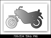
You don't have to draw a bike ... How about this for an idea ...
This is the letter "x" from the font TRANSPOR.TTF which is free (as far as I'm aware) from here ... https://www.wfonts.com/font/transportation ... Although you can check that out and make sure yourself. OR alternately, find it on a site that you yourself trust.
Just convert to editable shapes and adjust to suit.

Keith
~~~~~~~~~~~~~~~~~~~~~~~~~~~~~~~~~~~~~~~
There are 10 types of people in this world .... Those who understand binary, and those who don't.
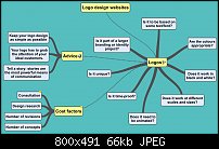
Youll find loads of advice online nowadays about logo design. I tend to use a mind mapping app called SimpleMind to help gather related information together. Heres a screenshot of my one I had started for logo design. I think one key piece of advice is being able to explain your decision making process.

Jono (Jon)
Xara Photo & Graphic Designer+
I'd be the last person to give advice on logo's, but I agree with Gary. Just that font change would make the difference. Just keep enjoying the drawing and it will all come together.
When dealing with a client, you really have to think 4 or 5 steps ahead.
This is professional advice and you can ignore it or take part of it or all of it, but just know I had to pay a lot of money at school to learn this, and you're welcome to use it or discard it. It's the internet and I'm just an internet nobody here.
When doing a logo for a client, I personally use the 3-2-1 system. Basically, you create 3 RADICALLY different drafts after talking with the client. If they have their ideas they absolutely want in the logo, you do 3 radically different takes, as far from each other as you can possibly get. If they say, 'you're the artist, do something' then it's up to you to ask THEM questions about their business and what they want to portray themselves as. It doesn't have to be super complicated or deep. The client might even just say, "I want something cool' Well that's awesome, so do 3 RADICALLY different ideas of cool.
After that, show them what you've done. They will say 'i like this about this idea' or whatever. Listen to them and you'll get a list of things to look at, you might even get a response like, 'I absolutely LOVE this one' and such. Whatever the response is, you listen to them, and make 2 more versions. These will take into account their input based on your initial 3. Make THESE two as radically different as possible. They might not be all that different overall depending on their reaction to the first three. For instance, say you do one they just say 'that's the one'. Insist that you'll do two variations of that idea/concept. Because this IS concepting. It's not logo designing yet. The logo is the culmination of the concept. So the 2 versions of the 'i love this one' might be, say, One is more iconographic and the other is more 'realistic'. Or you might play with colors, etc. You still give them choice within that realm of what they already said they liked. Alternatively, the client might also say 'i like the colors of this, but the style of that'. So you do two radically different, as much as possible variations of those elements they said they preferred.
Then, you'll present them with those two versions. They will still be able to say very little about them other than colors and style. At that point, you've narrowed down, with the customer/client, what they're after. And there's a chance, too, that they say, "I still love this one you did originally' and that's absolutely fine. The thing is to make them feel like they're involved, but you keep their choices down to minimum. Never give into just 'Yeah, but move this here a little', and have no cap on how many times they can say that. most clients THINK they know what they want, but they're not a graphic designer, they just 'see cool stuff' and think that's what they want. It's YOUR job to make NEW cool stuff and show them what their business identity is in graphics.
I know that seems like a lot of garbage to read through, but I hope it helps and good luck on the redraws. I think graphic design is a fascinating field, but I see all too often the 'get it right the first time' sort of approach and it's very much not that at all. It's like writing, you're going to go through a lot of drafts and polish things up and finalize things as you go. The initial idea might be gold, but will need some finessing to make it just right. Treat everything you do on that journey as ideas and don't be married to an idea until the client makes a choice then treat it like your baby and make it the best you can.
Loves and good luck!
PS if you'd like, I can show you a project I did with a client so you can visually see what I mean...one where I did all these steps and what they ended up with. It's up to you whether this seems like an approach you'd feel comfortable with but I'm more than willing to show you an actual case of where it worked out for everyone, which ultimately is the goal!You get to be creative and the client gets something they like.

See my some of artwork and hear some of my music at www.kniteforcerevolution.com
Yes I would like to see it, but you need to understand one thing. I just enjoy working with graphics and am not really very talented, hence TJ and others I have done stuff for are not really clients as this is a hobby for me. I just do it for a few local businesses that are friends of mine. That is not to say I do not give them my best, but my best as you can see by logo I have shown here is not professional. I wish I had the talent I see here on TG, but in reality I am just a old man with a hobby. I do thank you for the advise along with everyone else and would very much enjoy seeing your process. Thank You!
hseiken. Enjoyed reading your advice in your last post. You have a practical and systematic approach to projects, which can be applied to many aspects of daily life.
TJB
Bookmarks