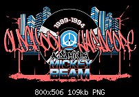
Here's a youtube title card for a buddy of mine's upcoming DJ mix. Again, it's based heavily off of Dave Noddings work for Suburban Base Records circa 1990-1995.


 Member
Here's a youtube title card for a buddy of mine's upcoming DJ mix. Again, it's based heavily off of Dave Noddings work for Suburban Base Records circa 1990-1995.
See my some of artwork and hear some of my music at www.kniteforcerevolution.com
 Member
I love this style and I think you have made an incredibly good design. The only thing about graffiti is that it is often illegible.
This says Old Skool Hardcore, methinks, but I'm not 100% certain!
** Detailed "Create A Spinning Logo Tutorial" is available in .pdf format for download at this link **
Outside of a dog, a book is a man's best friend. Inside of a dog, it's too dark to read. Groucho Marx.
 Member
Very well crafted, hseiken!Originally Posted by hseiken

I too have difficulty with the front font, although I was able to make out the hardcore.
The L.P. is very nostalgic for me!
R_o_n _a_l _d __C. __D_u_k_e
x a r a . c o m..a r t i s t s ..g a l l e r y
Xara's Facebook
Xara Designer Pro X 16, Xara 3D7 Web Designer
 Member
 Moderator Posthumous
hseiken I love your work, however like the others I find the text almost impossible to make out. At least I cannot read most of it.
Larry a.k.a wizard509
Never give up. You will never fail, but you may find a lot of ways that don't work.
 Member
A very nice design. I could see this used as part of a poster.
Ray
Member
Alternate version.
As for 'hard to read', it's not meant to be the same thing as a 'logo' where you can read it from far out instantly, the idea is to wow someone, challenge them to stare for a few seconds but not be impossible to make out and people who are aware of this style already expect what it says already.
As well, I think some of you are likely not the intended audience in the first place and so it could be argued that the 'right people' will get it.For instance, I'm not the target audience for Marvel movie trailers because I have no idea who anyone they're showing is and what they have anything to do with anything; it just looks like flashy special effects and flashy costumes and a hyper-confusing story, but when I talk to to fans of that series, they know exactly what they're looking at.
See my some of artwork and hear some of my music at www.kniteforcerevolution.com

 Reply With Quote


Bookmarks