Yes, funny strange. The technique is a great way to have some interactive graphics fun. It's about trying simple edits to the blend and watching what effect it will have. You can't really anticipate how it will turn out. Fun!Kinda funny when you think about it.
[Tip: to edit the start and end objects in a blend that has hundreds of steps, use ctrl+click to select the end shape in the blend -edit as desired- and then use the tab key to switch the selection to the blend's start object. The technique requires many steps in the blend and very high levels of transparency in the start and end objects. Those objects can be lines or shapes. In the case of lines you have line weights, rotations, skewings, scalings, colour, strokes, as well as transparency settings to play with. Lots of variables for something created with as little as two lines.]
Featured Artist on Xara Xone . May 2011
. A Shield . My First Tutorial
. Bottle Cap . My Second Tutorial on Xara Xone
Thanks Rik. And thanks Larry & Bob for your comments on the same image earlier. If you haven't tried SketchUp you should. The free version is good. Models like the candlestick are relatively easy to create. While SU isn't photo realistic it still can communicate 3d ideas quite well. Here's an example I created - It was all done in SketchUp (except adding the lettering) >> SketchUp Example <<That's seriously good.
I just had a good look at your image Penny. I really like it and I learned an important new word: >> guilloche <<
Thanks, Ross. Yes, it's a good word!
That looks good Ross.
I have a question for you.
Been looking at that guys freehand perspective and I detect am error
When he made a pitched roof he said copy the first side he made and past that line on the other end.
It is my understanding that when making a pitched roof that take the line and extend the line till it crosses in this case the left VP and use that point to make the line for the opposite visible side of the pitch, that puts it in perspective.
It seems like he just plops down a vp which is usually a corner shot,I do not like corner shots and prefer to set up my perspective to feature whatever I want to make most important. Anyway this simple example would be 1 point perspective. So the question is am I right or wrong.
Larry a.k.a wizard509
Never give up. You will never fail, but you may find a lot of ways that don't work.
Larry - I think I know what you are wondering about but it's hard to be sure. In your example it looks to me like you've drawn a flat roof rather than a sloped one.
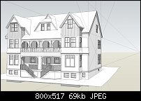
I attach a 3d model I made of >> this historic house in Charlottetown, PEI, Canada <<. It is a two-point perspective (although the normal mode for SketchUp is 3-Point). For illustrative purposes I've added in some construction lines. They show that the vanishing point for the roof is the same as for the wall. I also added in a 'X' on the wall to illustrate how the location for the pitched roof's ridge & gable is determined relative to the wall.

My misunderstanding! please ignore post please
Egg
Minis Forum UM780XTX AMD Ryzen7 7840HS with AMD Radeon 780M Graphics + 32 GB Ram + MSI Optix Mag321 Curv monitor + 1Tb SSD + 232 GB SSD + 250 GB SSD portable drive + ISP = BT + Web Hosting = TSO Host
Bookmarks