Assignment LOGO #2:
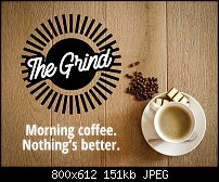
This logo is for a coffee shop in Seattle. There are only 5 shops so far and the company doesn't want the color "brown" in the logo, tired of seeing brown. My sketches started with the proverbial coffee mug but found it to trite for my tastes. Instead I brainstormed other associations for coffee time and came up with "strong morning coffee". So, I settled on the sun as my iconic image. It took me forever and a freakin' day to come up with the perfect font.
Impressions? I am pleased with this image and actually LOVE LOVE LOVE the ad campaign I placed the logo inside of a mockup ad. This logo has the ability to scale down and look way cool scaled way up. Cons? I took a while trying out different color schemes but decided a black-and-white color scheme fit the bill the best and it gave strong impact to the image which was in keeping with the idea of "strong coffee", which, I have, over the years, discovered most people prefer it that way (I personally don't).
So, what do you think of my design? Is it any good? Did I create an eye-catching image? You decide!

Mark


Originally Posted by Mark321

 Acorn - installed Xara software: Cloud+/Pro+ and most others back through time (to CC's Artworks). Contact for technical remediation/consultancy for your web designs.
 Reply With Quote

Bookmarks