This is the only difference I see.
Larry
EDIT; OK I see it now. the door and opening are slightly darker.b but it is very subtle.


 Moderator Posthumous
This is the only difference I see.
Larry
EDIT; OK I see it now. the door and opening are slightly darker.b but it is very subtle.
Larry a.k.a wizard509
Never give up. You will never fail, but you may find a lot of ways that don't work.
 Member
Actually, I darkened the image on the left.
(Just kidding) I did not darken either image. I only left the doorknob out of the picture on the right.
Member
I like this icon better. It works better on a smaller scale than the other version.

Last edited by Mark321; 27 May 2017 at 05:01 PM. Reason: Wrong version image
 Member
Hi Mark,
the icon is o.k. But the typography of INTERIOR DESIGNS is a fault.
A typography rule says about squooshing:
This is the inadvisable process of squashing or expanding a typeface digitally either to fit a space or for visual effect. If you do it, make sure you keep it to yourself.
The letterspaccing for caps is also not correct. I hope you're not angry with my criticism but this looks forbidden.

Member
Actually, Ernie, I agree with your criticism. But I see a more glaring flaw in the design. Every designer should ask themselves, "What else does this image remind me of?" And when I asked myself that question I got an unfortunate yet quick answer: It looks like a phallic symbol with a black cape. Yikes! So, I have got to change that too. I will probably delete the transom over the door. But always ask yourself that question to see what your image quickly reminds you of. You don't want your client to come up with that same impression, if it's a negative connotation.Originally Posted by ernie-f

Hopefully this looks better:
Dang. The words "Interior Design" is off center. I'll fix it.
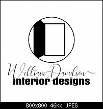
Last edited by Mark321; 27 May 2017 at 09:47 PM. Reason: Disliked the original font in "Interior Designs".
Member
Hi Mark,
I did't see a phallus in the door.
As a graphic designer I develop logos since ca. 30 years.
The procedure is allways the same:
1. Briefing with the client, his wishes and ideas etc.
2. Brainstorming, allone or in a group. Catch ideas, see what other desingner had for solutions, get inspiration but don't copy.
3. The most important part is scribbling, scribbling and scribbling one of the scribbles is sure in the choice.
4. Drawing the scribbled logo in a vector drawing software like XDP a good logo is only vector no bitmap or bitmap effects like shadow, trancparency, bevel etc.
See if the ready logo works for all purposes, B&W for in ex. a stamp or in color for ex. offset-, screen- and digitalprint, newspaper, t-shirt, lighter, ballpoint pen etc.
Allways when I work on logos I accept the typographical rules but no rule without exception, if it fits well.
So a process will take time. A good logo design is not a thing to do between two pots of coffee.
 Member
Hi Mark, I'm a little curious, what is this design being used for? Icon, logo, flyer, business card,.... Also, what kind of interior design are we talking about?
Ciao
Roly

 Super Moderator
Mark, in your client's area, do outer doors open inwards or outwards?
Acorn
Acorn - installed Xara software: Cloud+/Pro+ and most others back through time (to CC's Artworks). Contact for technical remediation/consultancy for your web designs.
When we provide assistance, your responses are valuable as they benefit the community. TG Nuggets you might like. Report faults: Xara Cloud+/Pro+/Magix Legacy; Xara KB & Chat
Member
LOL! Good point, Acorn!
Member
LogoInterior Decorating (some remodeling). I know very little about this industry. But he used the word "fresh" as one of his key words to describe his logo. I have considered turning the door into a window with shutters on BOTH sides of the window (but then I wondered if I would be "infringing" on Microsoft's logo too much). But that idea might serve as further inspiration and look cool too. But definitely no curtains in the window because that would make the icon too "busy", in my opinion here.
Mark
 Posting Permissions

 Reply With Quote
Bookmarks