 Re: Stop and Post February 2017

Originally Posted by
iamtheblues

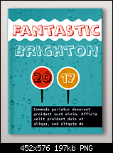
Thanks for posting, Jono. It could be my (failing) eyes, or it could be the size of the .png, but the sparkle is too subtle for me to see.
I like the use of Alphabet Soup for the informal quality it gives your design. I like Brighton, too - what's not to like!?
Bob.
Thanks Bob - your eyes aren't failing you. In haste I posted up the wrong file which looks like it breaks a design rule about contrast, ie if two elements are only slightly different you don't have contrast you have conflict. In this case the sparkles just look like faint smudges!
Here's a more contrasty version using the droplets overlay (we've had cold rain and sleet on and off all day here!)
Jono (Jon)
Xara Photo & Graphic Designer+


 Reply With Quote

Bookmarks