Welcome to TalkGraphics.com
Page 1 of 10 123 ... LastLast
Results 1 to 10 of 97
  1. #1
    Join Date
    May 2002
    Location
    Liverpool, NY
    Posts
    2,683

    Default October 2014 Tips and Tricks - Big GIFs, Tiny Animations

    October 2014 Tips and Tricks - Big GIFs, Tiny Animations

    Click image for larger version. 

Name:	2014-10-tt-2-pumpkins.gif 
Views:	1391 
Size:	41.6 KB 
ID:	104342

    This month, Gary Bouton takes you on an animation trip that’s sweeping the Web: creating a large GIF file that is animated in only part of the overall image. The GIF can be advertisement size, but only a few kilobytes when you see how to set up a GIF document in Xara, and customize how the GIF file is written. Work through the tutorial and get carved pumpkins for your efforts!

    See for yourself and then show us how you get your animated GIF on.
    Barbara Bouton
    TalkGraphics Forum Administrator

    The Xara Xone website developer. | TheBoutons.com

  2. #2

    Default Re: October 2014 Tips and Tricks - Big GIFs, Tiny Animations

    Ok, here is my contribution to this.

    As people may have noticed I am lazy person so used little different technique on this.

    Carvings are part of the image and are basically just erased from the picture so that the background can be seen through. After that the image is duplicated and moved a little to get the 3D effect and give some depth for added illusion. Finally the image simulating light is put at the back and the opacity is changed between the frames.

    Result is lazy mans Halloween but could use some extra colours.
    Attached Thumbnails Attached Thumbnails Click image for larger version. 

Name:	halloween.gif 
Views:	659 
Size:	128.2 KB 
ID:	104347  

  3. #3
    Join Date
    Oct 2002
    Location
    Liverpool, N.Y.
    Posts
    6,112

    Default Re: October 2014 Tips and Tricks - Big GIFs, Tiny Animations

    Lest anyone’s feeling be hurt (although I’ve noticed this to be fairly thick-skinned crows!), let me provide a definition of the word critiqué before we go any farther; the word criticize is a derivation of critiqué, but not truly the same word. Critiqué (noun): An unbiased evaluation or appraisal of a work or body or work.

    When you remark that something is good and you say it’s good, what you have said is a critique. Similarly, when something is bad, you call a spade a space, not partiality, no extra points because the creator is your friend or something.

    Theinonen, I’m going to take a pass on remarking about your work, because 1.) You’ve stated twice that you’re lazy, and that 2.) you used a “slightly different technique” on your animation. Which means you either disagreed with it or didn’t read it, which sort of defeats the point of me spending time creating a monthly tutorial for you; the word tutorial is a derivation of the word “teach”.

    I have a few questions to throw out for anyone on this area to answer (or to ask me for the answer). And I’d like honest answers, not snarks or jibes.

    1. Why is Theinonen’s piece 10K larger than the one I taught to build, seeing as this month’s tutorial makes the promise to make large animated GIFs that are small in file size?

    2. Why is there clearly banding inside the faces when lit up: hint-it has something to do with a Global Optimized palette and very little to do with the Maximum number of colors used?

    3. Why does the background image appear to vibrate from frame to frame, even though in theory it’s the background and should not change from frame to frame unless an Overlay shape is on top of that area—which is not the case.


    If someone doesn’t learn anything on The Xara Xone, then I am to blame, not the person who is playing student for the moment. It means I’m not doing my job, and this is why I’m tossing out these questions.

    I’m not calling you out, The Oninonen. This is a critique area, I’ve just been prompted to ask questions by your post, and you, unfortunately, chose to go first in “class”. :)

    My Best,

    Gary (frequently a student)

    By the way, I like the fact that Thenonin elected to design his own pumpkin faces. It shows creativity and exploration, and doesn't impact on the gist of the tutorial at all.
    Last edited by Gare; 20 October 2014 at 01:14 PM. Reason: I speled "turtle" rong.

  4. #4

    Default Re: October 2014 Tips and Tricks - Big GIFs, Tiny Animations

    Damn, you made me do another one....

    I was not aiming for masterpiece earlier and it was literally done in less than 5 minutes (includes typing the message), while I was on coffeebreak home as had to go walk the dog. It was just to illustrate another approach and was not intended for anything more.


    File is pretty large but if wanted any smaller then would need to reduce frame count. I can actually optimize your animation with Intergif and the result is over 2 KB smaller without affecting the quality of the file so this is as small this will get without changes and getting it little smaller does not justify the decrease in quality.
    Attached Thumbnails Attached Thumbnails Click image for larger version. 

Name:	1.gif 
Views:	935 
Size:	518.6 KB 
ID:	104349  

  5. #5
    Join Date
    Oct 2002
    Location
    Liverpool, N.Y.
    Posts
    6,112

    Default Re: October 2014 Tips and Tricks - Big GIFs, Tiny Animations

    Quote Originally Posted by theinonen View Post
    Damn, you made me do another one....
    This is a terrific post because it spawns a number of discussion points, and I feel great that I said something provocative and offensive to get you to try harder, theinonen. This version is much better artistically than the original one in post #2.

    The artifacting is gone, and it looks like quite a high-quality GIF, although it's five times the size of the target size. Which means it would slog down a page of graphics and text, even on a fast connection. And that really was not the point of the tutorial.

    If you do not care to read a tutorial, and simply recreate media using your own techniques, I should create a new area called “Duplicate this!” or something; it would be a fun challenge and I’m sure there would be a lot of participation, as was done with your SmartCar you rendered.

    But as Moderator as well, I’d suggest that you follow tutorials and post here, because that is the reason for Xara Xone’s existence (which some see cynically, but tough darts): to promote the use of Xara, and my job is to provide examples that can be performed in Xara using some animation “rules” for the GIF file format, such as don’t use high-frequency images because gradients and stuff will tend to produce banding, and only let the current frame create changes in a small area as an Overlay doesn’t write unchanging pixels to the finished file.


    Quote Originally Posted by theinonen View Post
    File is pretty large but if wanted any smaller then would need to reduce frame count.
    It doesn’t have to be, and again, that was part of my tutorial. In a real world situation when you’re hired to create a big animated GIF, and you bring in a 500KB file, your client won’t buy, “It can’t be done”, because they’ve seen it done on the web. There are lots of clever workarounds: limit the number of colors, limit the number of frames, create a low frequency photograph, use a Global Optimized palette, use a third party assembler.

    Quote Originally Posted by theinonen View Post
    I can actually optimize your animation with Intergif
    I’m sure you can, the theinonen. And InterGIF, as far as I know, is a third-party product, the name of this site is The Xara Xone and not The InterGIF Xone, therefore it’s not reasonable that I reach out in a tutorial for an effect that can be done in Xara, written tutorial style in Xara, and I think by now many, if not most, members in TG know that some things can be done faster in programs other than Xara. Third party filters are just fine to discuss here, I encourage any means to an end, within a given context. However, if I can generate an acceptable animation for my client using Xara and only Xara, and getting a small(er) finished file size, using InterGIF is sort of like replacing a light bulb that isn't burned-out.

    I’m deeply troubled by our volley, thetheinonen. It appears to be getting more and more contentious, as though I’m wrong, and being rebuked, when all I did was write an article on how something can be accomplished in Xara, and perhaps that’s the only program a member owns. Again, if you want to duplicate artwork in a tutorial your own way, I’ll start an area on tg for that purpose.

    For this area, though, if any of us wanders, it should be for the purpose of demonstrating, riffing on a principle, sharing a principle, asking for criticism, but if one learns nothing from the tutorial, one has nothing to share about the topic of discussion, and posting finished work here would be better served in a gallery, or a specialized area of tg, would you not agree?

    My Best,

    Gary
    Last edited by Gare; 20 October 2014 at 05:03 PM. Reason: Compulsive behavior. If I don't edit once a day, I will die.

  6. #6
    Join Date
    Jan 2006
    Location
    Urmston, Manchester,England
    Posts
    2,527

    Default Re: October 2014 Tips and Tricks - Big GIFs, Tiny Animations

    Hi Gary, just read through the Big Gifs Tips and Tricks and will be making my attempt at re-creating it tomorrow, it looks pretty cool. I also had a look at the two links you have at the end of the tut., and to have a Tips and Tricks based on these Cinemagraph Gifs would be fantastic but I hope first, time permitting, you will get round to doing the Video on Typography you talked about a while ago, looking forward to that one especially.

    Best regards,
    Stygg

  7. #7
    Join Date
    Oct 2002
    Location
    Liverpool, N.Y.
    Posts
    6,112

    Default Re: October 2014 Tips and Tricks - Big GIFs, Tiny Animations

    Forthcoming, stygg, this m onth, in fact. In a day or two we will get back to page and layout, and I'm going to highlight two things: your font collection make some suggestions for print and some of the best web fonts—you use different typefaces for different media—and then I'll some stuff on paragraphs, because there is an overwhelming number of free headline typefaces, and a paucity of body copy free typefaces on the Web.

    Justification, proper paragraph breaks, how to do a text callout, basically how to deploy your fonts to design a page. Graphics are subordinate and textr is the star this month.

    Nothing overwhelming and fun body copy and graphics will bew provided. Time permitting, I'll even design a font for us to play with.

    But this is the wrong place (but the right time) to advertise the video this month!

    Just keep the faces on thew pumpkin small like we've done, and because the background is muted, you can get away with 64 max colours without the need to dither (dithering adds file size). Don't use gradients on the faces if you make your own, because that will increase file size if you try to increase the global colour palette. GIFs actually need all 256 indexed colour to make a smooth gradient!

    Boo!

    Gary

  8. #8
    Join Date
    Oct 2006
    Location
    StPeters, MO USA
    Posts
    10,819

    Default Re: October 2014 Tips and Tricks - Big GIFs, Tiny Animations

    Gare I had a go at this. I darkened the image a bit just to show that I did indeed do the tutorial. Also in frame 2 I cut the dark pumpkin lights out which further reduced the file size. There are a couple of things that bother me some such as the darker images of teeth and I'm not sure if this is a result of something I did or what. Anyway what is your opinion?
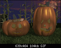
    Click image for larger version. 

Name:	from Gare tut.gif 
Views:	857 
Size:	104.1 KB 
ID:	104350
    Larry a.k.a wizard509

    Never give up. You will never fail, but you may find a lot of ways that don't work.

  9. #9
    Join Date
    Oct 2002
    Location
    Liverpool, N.Y.
    Posts
    6,112

    Default Re: October 2014 Tips and Tricks - Big GIFs, Tiny Animations

    Larry, I'd slow the duration times on both frames because it's a little frantic. Try .2 seconds instead of .01. If I suggested .01 in the tutorial, I should be boiled in oil, Sorry!

    Oh, and one of the 2 frames has a sliver of white on the left size. you can fix that by, one frame at a time, selecting all, and then nudging perhaps once to the left, then do the same with the following frame selected. You might then need to mode the right page edge a little to the left...it snaps when you're using an animation template. Secret: if an image overlaps the page size by a pixel or two, Xara truncates it when you export, because it falls outside of the page, and stuff off the page doesn't get exported.

    I'm also sorry I didn't stress that you, the artist, have the decision-making power to cheat the dimensions down a little to be able to use more frames as a trade-off for final pumpkin GIF file size. Because what I did for one of those animations was to use 8 frames, plus the lit eyes used Transparency. Here's exactly what I did on a smaller (520 px across, I think) image to truly make a flicker instead of flashing like a traffic sign:

    Frame 1: .5 seconds (off)
    Frame 2: none (on)
    Frame 3: .1 seconds (off)
    Frame 4: .1 seconds (on)
    Frame 5: .1 seconds (on, but at 75% opacity)
    Frame 6: .1 seconds (on, but at 45% opacity)
    Frame 7: .1 seconds (on, but at 15% opacity)
    Frame 8: .1 seconds (on, 100%)

    Try that and see if it isn't more visually interesting. Also, you might have a few K to spare now that you darkened the background, which is fine artistically, and this action also probably lessened the number of unique colors, making diffusion dithering necessary.

    This whole deal is intended to help you get farther with fast, large GIF animations. You already know some of the techniques to make a file size for GIF animations small, right? A smaller color index (palette), choose not to use Transparency when you write it out, because the Overlay Property is engaged and takes care of the transparency around the faces, make small sacrifices in quality because your market often is viewing on a smart phone and won't scrutinize your animation at a size that the flaws might show and so on.

    This is just a novel concept to produce large pictures with small areas of animation going on within them. As are cinemagraphs, and perhaps we can to a tute on those soon, perhaps a Christmas present from the Xone Pole in Wasala, Alaska, where you can open your window and see Russia.

    -g

  10. #10

    Default Re: October 2014 Tips and Tricks - Big GIFs, Tiny Animations

    Is there really a difference if the background object comes foreground object and the background object/objects are the ones that are animated instead? Honestly I can see no reason why it could not be done in Xara or any other software as there are afterall only different images stacked on top of each other.

    If you are going to bring PNG file to a program, then why not just as well use alpha for the carvings as those are static anyway and are not going to change during the animation. Only the light changes inside the pumpkins so it kind of makes sense on a conceptual level. I used colour block blended from white, yellow and red colours to make it appear more like a softer candle light but it could have been only a rectangle of solid yellow colour if the gradient and banding are disturbing too much.

    And I see no harm if you are bringing assets from other software anyway, if afterwards run the finished product through some commandline tool to optimize the resulting file if wanted.

    PS. Internet connections are nowdays really fast and here in Finland 100 Mbit is starting to be what people have as 10 Mbit is not much cheaper and 10 times slower. I would go as far and say that filesizes are not that relevant anymore as they used to be when I was just a boy.


Bookmarks

Posting Permissions

  • You may not post new threads
  • You may not post replies
  • You may not post attachments
  • You may not edit your posts
  •