How can I make xara dynamically resize to look good in iphone websites? Thanks

 New Member (No PMs)
 Mobile Friendly Website
How can I make xara dynamically resize to look good in iphone websites? Thanks
 Member
Re: Mobile Friendly Website
Member
Re: Mobile Friendly Website
Xara makes WYSIWYG-software which, as the term implies, does not dynamically resize on different devices.
 Member
Re: Mobile Friendly Website
Member
Re: Mobile Friendly Website
You have two options:
1. Design the site so that it looks good on any device by making sure that it: loads quickly, it is clean with plenty of white space and content is easy to read and navigation is clear - people don't mind zooming in and out on a mobile device as much as some people think they do.
2. Design two sites; the main site as well as a mobile site, you can have all the content on the mobile site or just what a visitor my need. You can then use a script to redirect mobile browsers to the mobile site.
 Member
Re: Mobile Friendly Website
Member
Re: Mobile Friendly Website
Hi skech, which of these methods did you use on http://www.balti-house.com/ , this site is not a dynamic design but it does adjust to my smartphone screen in both positions,
best regards,
Member
Re: Mobile Friendly Website
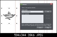
I used the first, no need to do anything else except name an object NoViewportMeta you can do this by right clicking any object and click on 'Names' then type the name, click the 'Add' button and that's it, when you publish the site xara will add amend the code. This will force the browser to show the site at 100%, no matter what the screen size.
 Posting Permissions

 Reply With Quote
Bookmarks