This month Design a letter B Drop Cap
Here are a couple I have so far.


 Moderator Posthumous
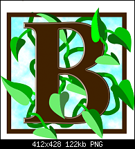
This month Design a letter B Drop Cap
Here are a couple I have so far.
Larry a.k.a wizard509
Never give up. You will never fail, but you may find a lot of ways that don't work.
Moderator Posthumous
I know it not quite the same as the others similar to this but here is another form me.
Larry a.k.a wizard509
Never give up. You will never fail, but you may find a lot of ways that don't work.
 Member
"B" for BOLD. C'mon guys and gals, let's see your work! Here's a link if you need some inspiration.
Bob.
** Detailed "Create A Spinning Logo Tutorial" is available in .pdf format for download at this link **
Outside of a dog, a book is a man's best friend. Inside of a dog, it's too dark to read. Groucho Marx.
 Super Moderator
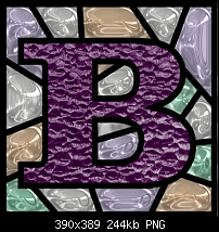
I love the 'B' in Post #2, Larry.
How did you do that?
Featured Artist on Xara Xone . May 2011
. A Shield . My First Tutorial
. Bottle Cap . My Second Tutorial on Xara Xone
Moderator Posthumous
Good one Bob. Thanks for the Link. Here is one for you http://www.dailydropcap.com/
Rik what I did was fairly complex. Mostly it was a combination of Xara and FilterForge. with some fills and transparencies.
outlines, The outlines was done including the B with no fills Will I did have fills but then copied the B fill to the Clipboard and cleared the fills so all I had was just the line work, grouped all the outlines lines together and used FilterForge. Then added back the the B and removed that particular line and then cloned, and, this is where I may have done something weird, I filled the clone with a glass fill then applied a brightness transparency, brought the line work to the front and made the other fills with harmonious colors and put those to the back.
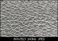
I don't remember where I got that particular glass so I cannot give the source credit but if you want it here it is. Gary not quite but good guess.
Larry a.k.a wizard509
Never give up. You will never fail, but you may find a lot of ways that don't work.
Super Moderator
Ah! I see, Larry.
It was a very simple thing to make.
Featured Artist on Xara Xone . May 2011
. A Shield . My First Tutorial
. Bottle Cap . My Second Tutorial on Xara Xone
 Member
You are getting very good with those stained glass Drop caps Larry. Here is a simple one with a repeating pattern and a letter with a simple flat fill. I kind of like the contrast between the complex pattern and the simple letter.
[SIGPIC][/SIGPIC]
My current Xara software: Designer Pro 365 12.6
Good Morning Sunshine.ca | Good Morning Sunshine Online(a weekly humorous publication created with XDP and exported as a web document) | Angelize Online resource shop | My Video Tutorials | My DropBox |
Autocorrect: It can be your worst enema.
Moderator Posthumous
Gee thanks Frances. Coming from you that is high praise indeed. I kind of thought I liked the last one but changed my mind again and now prefer the one in post 2 that Rik commented on. I don't know about you guys but I plan on doing the entire alphabet with certain ones the stained glass being one. Of course they will be done one month at a time. Personally I like this challenge almost as much as the scribbles, and from the looks of it you like it too. OK back to your drop cap. Good Job Frances! One thing I wonder though is when your drop cap is reduced down to a small usable size if that background will hold. I do hope people do not get tired of this challenge before the alphabet is complete though. There was a couple people that went great guns but I haven't seen them this month yet, but, who knows they might still.I hope so anyway, and, I hope a few more people join in. The stuff I do is fairly simple because I'm just not good with flourishes and lots of curly cues. Ah well, we do the best we can eh.
Larry a.k.a wizard509
Never give up. You will never fail, but you may find a lot of ways that don't work.
Member
Here's one using an unusual display font.
I used the convert to editable shapes/ungroup twice method to apply the different colours.
Thanks for the link, Larry.
Bob.
** Detailed "Create A Spinning Logo Tutorial" is available in .pdf format for download at this link **
Outside of a dog, a book is a man's best friend. Inside of a dog, it's too dark to read. Groucho Marx.
Moderator Posthumous
You are welcome Bob. That font works well for that, what you did with it makes it look like zip-a-tone was applied. Interesting technique, Bob. Thank you for another fine contribution.
Larry a.k.a wizard509
Never give up. You will never fail, but you may find a lot of ways that don't work.
 Posting Permissions

 Reply With Quote


Bookmarks