Also following Gary's suggestion, is this better?


 Member
Also following Gary's suggestion, is this better?
 Member
I'm afraid the angle of the first hands is my preference, but it is better.
I'm sure you'll get other comments.
 Super Moderator
I took the "hands" to be angel wings in the first version!
Sorry.
Acorn
Member
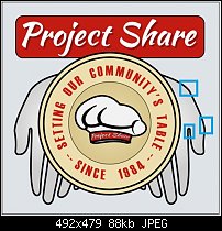
I agree with all your comments. The hands were rotated into an unnatural position or hidden too much by the plate but I did this to cover any 'amputated' wrists, which would not look very good. Acorn, you had the right impression because I tried to have hands that also resemble angel wings to reflect the nature of this organization's work.
So, here is another effort. Let me know what you think.
Member
 Member
I think it is very good idea and the hands got to their positions. Maybe a final touch yet and it is ready, those three points are only my impressions where something should be done. But not sure
Member
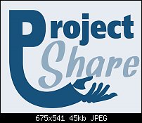
First time I've ever done this on the Forum [I have sold a few for some small businesses but I won't be moving to my own island on the proceeds] so here goes.
I have used the website colours and different fonts more businesslike for 'project' and friendlier and softer for 'share'. I tried to keep the logo as simple as possible but still convey that the charity shares. Anyhoo that's what I was thinking - whether it hits the spot is a different matter altogether!
Cheers
David
Member
It's very clever, but it doesn't convey the story of feeding people and the outstretched open hand perhaps doesn't give the right message.
Member
I see your point and it does almost like it's 'asking for something' but personally I am not lover of logos that are too literal but I will sit back think about this and approach it from another angle. I don't like to be beatenOriginally Posted by pauland

Cheers David
Member
Thanks Pauland and Csehz for your feedback. I stylized the hands a little more.
 Posting Permissions

 Reply With Quote

Bookmarks