Boy if you use any version of Xara 3D you will want to install the TTF font. Xara 3D Maker 7 and Xara 3D 6 are known to not recognize the OTF font format.
Boy if you use any version of Xara 3D you will want to install the TTF font. Xara 3D Maker 7 and Xara 3D 6 are known to not recognize the OTF font format.
Soquili
a.k.a. Bill Taylor
Bill is no longer with us. He died on 10 Dec 2012. We remember him always.
My TG Album
Last XaReg update
Thanks for the extensive reply, Gary. Can't say that I understood all the technical ins and outs about fonts but I guess I don't really need to.
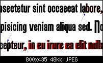
I attached the requested screenshot. The black text on top is the .otf version. I added some arrows to point out the slight shift between the 'a' and the 'b' and the 'e' and the 'p'. The shifts when a comma is involved are quite clear, especially when preceded by the 'r'.
After experimenting some more I believe something is wrong with the kerning in some cases. The 'j' (in both versions) overlaps with preceding characters. I'm not really sure but I also noticed some variations in kerning of the caps.
Hope this is helpful.


Hi boy—
It looks like two differences, and both would be addressed in the code of the typeface and not the characters themselves. One is a Baseline difference, and the other is a metrics, probably kerning difference.
I, or Bill, or anyone with experience with Fontographer of FontLab, could go in and make the TTF and the OTF identical (I think, I'm not sure), but ultimately doing this would be an exercise, and not a service to the user.
Why? Because practically speaking, no one is going to use both the TTF and the OTF versions simultaneously.
Is there a "better" version out of the two? It's debatable. The kerning difference is truly marginal, and the baseline difference will not show if you type, for example, paragraph text, because the lines are consistent relative to one another. And this is a headline font, not a body text font.
Bill is completely correct: Xara 3D and most modeling programs are coded to understand Truetype, but not Type 1 or Opentype. They just do; it must be a programming thing.
Let's stop talking about the font, and let's use it!
My Best,
Gary
Thanks for explaining all that. I learned something new again.
One thing, though, and I wasn't very clear about it, the second picture shows the kerning issue of the 'j' for one and the same font version (.otf) but the issue occurs in both versions.
My thoughts exactly so I have decided to start a special font play for our new font! see hereLet's stop talking about the font, and let's use it!
[SIGPIC][/SIGPIC]
My current Xara software: Designer Pro 365 12.6
Good Morning Sunshine.ca | Good Morning Sunshine Online(a weekly humorous publication created with XDP and exported as a web document) | Angelize Online resource shop | My Video Tutorials | My DropBox |
Autocorrect: It can be your worst enema.
Bookmarks