Thanks for the extensive reply, Gary. Can't say that I understood all the technical ins and outs about fonts but I guess I don't really need to.
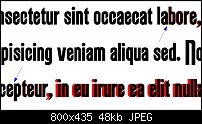
I attached the requested screenshot. The black text on top is the .otf version. I added some arrows to point out the slight shift between the 'a' and the 'b' and the 'e' and the 'p'. The shifts when a comma is involved are quite clear, especially when preceded by the 'r'.
After experimenting some more I believe something is wrong with the kerning in some cases. The 'j' (in both versions) overlaps with preceding characters. I'm not really sure but I also noticed some variations in kerning of the caps.
Hope this is helpful.


 Reply With Quote

Bookmarks