


A couple of things come to mind now that I can look at your original site close up.
1. The yellow text on the brown background is hard on the eyes, perhaps a lighter brown background with dark brown text would retain some of the folksy appeal yet give you a cleaner look kind of a compromise between your original site and your daughters ultra clean layout.
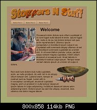
2 you do some beautiful wood work take some of the photos and crop them out of their backgrounds, make them big (supersize them!) and repel the text around them and really show them off.
3 Stoppers N stuff is a great name perhaps instead of the wood filled banner give the name some personality, mold it bevel it and give it a wood fill
I have attached an example of what I mean (I hope you don't mind!) I just dropped in some Lorum ipsum filler text and a navbar from the designs gallery I also let the bowl overlap the edge of the page you will need to go into the website properties page and deselect clip to pages to do this.

 Reply With Quote


Bookmarks