

Hi again John. I have just been looking at the wrought iron site again, as I did not look at it for very long last time. Some tips below that you may be interested in.
Perhaps consider changing the text boxes from centre alignment to left-justified as you will find it will give a better flow to the page, be easier for site visitors to read, and will look more elegant. You want your website to look more like a coffee table magazine than a 'shouty' add, so perhaps make the headings a wee bit more smaller, and not in red (especially on the home page). Although once it is left justified it may look quite okay with the larger fonts. Experiment a bit.
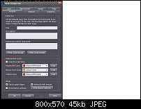
Text links - go to the Web Properties and uncheck the Underline Text Links so that the links in your text will still be obvious as something to click on (as they are coloured links), but will not make the page look so cluttered. And speaking of your link colour, it is the same colour as your headings on the home page, and that is confusing. Your headings, and other things you do not want people to think are links, should be a different colour to the link colours. Try using a complementary colour.
Nav Bar - as you now have Xara 16, move the navigation to the top of the page and make it a sticky so it is always visible - this will make it so much easier for website visitors to find quickly what they are looking for.

 Reply With Quote

Bookmarks