

 Mobile Variant issues - can't get phone link to work and text is pushed right
I'm using Xara Web Designer Premium 12.6.2.49603 DL x64
I'm checking my mobile site with my Samsung Galaxy S7
www.DavidsAppliance.biz
When I check my mobile variant site on my PC by squeezing the browser window down the text is centered nicely, but when I check my site on my phone the right side of the text is cut off. After fiddling around with it for a while I've discovered the text boxes are getting pushed over to the right a little. The photos and objects stay centered properly but the text won't hold still. I'm working on a 480 wide site but the text gets chopped at what would be the 425 mark. But again, it looks fine on my PC screen.
Maybe it's just some weird setting on my phone.
Also I've been arguing with the phone number link for two or three hours. I've entered my phone number in the "Link to web or email address" window with "tel:" just before it but it won't work on my phone. I tried putting a space between the "tel:" and the number but that didn't work (didn't think it would but I was getting desperate).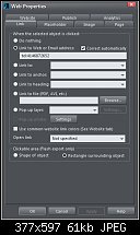
Does having the menu button interfere with the phone link somehow? I can't imagine it would but I don't know how this software works. Heck, I don't know how ANY software works.
Now after arguing with it for hours the text for the phone number won't stay the right size either. It should be the same style as the menu button but it's changed to a tiny black font.
It's 8 in the morning and I've been at this all day yesterday and all night. I think I need to get some rest. Maybe it'll work better after I get some sleep.

 Reply With Quote

Bookmarks