

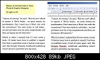
Noticed that PagePlus renders body text like Adobe Framemaker -- sort of rough, not smooth like XDP or Publisher or Word. Using a font called Lexia DaMa, to replicate Kindle's PMN Caecilia, but I get the same rough effect using Times New Roman or Arial. Using a 10" Acer netbook, 1024 x 600, Win 7 Starter, ClearType turned on and tuned. Any ideas? Here's what it looks like --

 Reply With Quote

Bookmarks