Thanks, Frances.
My best guess was Coconut palms.
Barb is busy putting charmed neutrinos in a particle accelerator for dinner.
-g


 Super Moderator
Thanks, Frances.
My best guess was Coconut palms.
Barb is busy putting charmed neutrinos in a particle accelerator for dinner.
-g
Super Moderator
I've got a variation on the marbles image.
I've attached a scene whose back row of marbles were not in the original render.
They are filled shapes created in Xara from the picture. They're blurred behind the back original row, using Live Effects, a Clipview and the background is partially blurred using a copy of the original and a transparency so the middle of the photo is in focus.
Take apart the composition to see how it's done, and then try your own variation on it.
gare
 Member
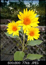
I had a go at the sunflower image. One year I grew a variety that had multiple flowers on each plant and they really did have one large flower and smaller side flowers.
I don't know how convincing my editing is but here is my Xara edited sunflowers.
[SIGPIC][/SIGPIC]
My current Xara software: Designer Pro 365 12.6
Good Morning Sunshine.ca | Good Morning Sunshine Online(a weekly humorous publication created with XDP and exported as a web document) | Angelize Online resource shop | My Video Tutorials | My DropBox |
Autocorrect: It can be your worst enema.
Member
Not upgraded to Pro8 yet so it's a continuation of slicing and contones and brightness levels I've used on this image, with a little extra?
Stygg
Altered the dark contone on yellowish flower in second image. Pistol in pot image, be careful how you say that
Last edited by stygg2003; 20 July 2012 at 01:17 PM.
Super Moderator
Your precision is excellent, Stygg, and yes, you successfully worked around version 8-specificity.
Wasn't "There's an Alligator in My Zinnias" a popular folk song in the mid 16th Century?
Next step for you, my firend is to work on the contrast of what you've retouched. Compare the uncolored Zinnias to your work. Easy enough to do if you just make a copy with alpha (Ctrl+Shift+C), and then with the Enhance tool, increase the Contrast to about +7 and reduce the Brightness to perhaps -4...or use the Levels dialog, actually, as described in the video.
Your work is inspired, fun, and clever, Stygg. These are all qualities of a successful artist.
Art doesn't depend on technique alone, but rather on what it communicates.
-g
Member
Cheers for the advice Gary, just done as you suggested, compared the two images then used the enhance for Brightness and Contrast, even on the leaf and the croc, what a difference! I'm well pleased with that
Stygg
Super Moderator
Stygg
I know you did several variations. Is the post #56 truly your latest? The file name and your post #54 look very similar.
Here's the difference I was able to make with the Enhance tools, just for reference:
My Best,
Gary
Last edited by Gare; 20 July 2012 at 02:29 PM.
Member
The last post was with the brightness and contrast on each object altered to Brightness -4 and Contrast to 7 ? I will have to compare your latest one with mine, see if I can achieve your image which is great.
Stygg
Super Moderator
Stygg—
Don't go by the numbers I offer you, but instead go by what you see on your monitor. There is no sure-fire recipe applicable to all images—all systems are different all images are different, one size ("setting") does not fit all.
My monitor, almost for sure, is calibrated differently than yours. And try Levels instead of the Brightness Contrast I originally offered, sorry. Levels worked for me in post #57.
-g
Member
Tried to alter the image in Levels and did get a better result, so as you say don't go by the numbers go by what you see, as my monitor and some other factors will be different. The point being with the flower image though, is that I was able to work round v8 and apply the skills I learned earlier, so every reason to be pleased.
Stygg
 Posting Permissions


 Reply With Quote


Bookmarks