 Google Font "inter" strangely made corrupt display
i can hardly believe it
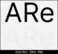
I have a font from Google "inter" and the A for example is made like an upside down V with a bar in the middle, which is just lying on it, so actually 2 objects.
Other letters like the e overlay themselves.
see attachment.

AN exported PDF from indesgin looks OK,
when I export the font from Xara I often have holes in the overlaps.
Is this really how fonts are made now?
What can I do to make it look reasonable as a pdf?
no sicknature. for nearly 20 years. omg ...
For many problems there are simple and easy-to-understand solutions that do not work.


 Reply With Quote

Bookmarks