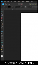
I found Office 2010 the easiest version to use because it had the most colourful toolbar buttons. Office 2013 was pretty flat and difficult to distinguish buttons because it was either monochrome or very nearly monochrome, but to their credit, the current version of Office 365 (Microsoft 365? If there's one thing that Xara and Microsoft have in common, it's that they can pick confusing product names and version numbers) has re-introduced colour and it is much better for it.
It has, and it does. I can't use it for toffee though, every time I try, I give up because I can do things in Xara quicker - even with ropey toolbars.


 Reply With Quote

Bookmarks