with you on that egg
and wasn't it zeb who said he didn't care what the UI was like because he spent most of his time looking at the workspace....


 Member
with you on that egg
and wasn't it zeb who said he didn't care what the UI was like because he spent most of his time looking at the workspace....
-------------------------------
Nothing lasts forever...
 Member
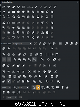
I've used the new interface for a few days and while I wouldn't have chosen to switch, I don't think that it's a bad step.
Looking side-by-side at the previous icons and the new ones, it's obvious that someone has put in a lot of work.
I really feel for whoever had to make them in single colours though - it really can't have been easy: seeing what they included, removed, and had to change is fascinating.
I think the "Photo Heal" button is interesting, why it isn't a X shaped plaster anymore - it isn't obviously a plaster now but I'm interested to know what it would've been like if the original was just made a single colour.
The"Palette from photo" tool lost its squares of colour, obviously, and that's I think my favourite change - tied with the "Panorama" button: having lost the visual clue of grassy hillside and sky to imply panorama, the new button is clever.
The "Clone/Magic Erase" button is very pin-on-a-map or "location"-like, and less stamp-like.
 Member
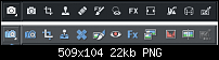
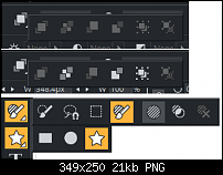
I've a question for those using the new interface. How does it handle 'not-usable'/'usable' and 'not-activated'/'activated' states such as shown in the old interface?
Member
there is a school of thought that coloured icons can be confusing as the colour can take precedence over the shape
the same shape all different colours - easy to differentiate
the same colour all different shapes - easy to differentiate
different shapes and different colours together, confusing
the smaller the icons become the more this is so; the brain goes for the colour first and can 'lose' the shape
so some will find it easier and some will not depending on their familiarity with the original and how well they differentiate the icons...
-------------------------------
Nothing lasts forever...
Member
Doh, I just spent ten minutes looking for a button for 'not-usable'/'usable', wondering how I'd used Xara for 20 years and never heard of that
I realised what you meant, and here you go...
Member
The full set
Member
Originally Posted by JoeSomebody

Don't forget you can always switch to a light and colourful interface by using Sift+Control+Alt+S although this seems to have been forgotten by Xara recently and has a couple of minor issues with visibility of some elements (e.g. in the page and layer gallery) also the button pallet has display problems as lots of the button on that are not visible!
 Member
Great to see you Rob!
Egg
Intel i7 - 4790K Quad Core + 16 GB Ram + NVIDIA Geforce GTX 1660 Graphics Card + MSI Optix Mag321 Curv monitor + Samsung 970 EVO Plus 500GB SSD + 232 GB SSD + 250 GB SSD portable drive + ISP = BT + Web Hosting = TSO Host
Member
Thanks. I guess after a while one gets used to the new scheme but I prefer to have some colors to help the brain locate the needed button and its state a bit faster.
 Member
Not forgotten ... the light interface (although available) is no longer officially supported.
Keith
~~~~~~~~~~~~~~~~~~~~~~~~~~~~~~~~~~~~~~~
There are 10 types of people in this world .... Those who understand binary, and those who don't.
 Posting Permissions

 Reply With Quote
Bookmarks