4, then 1.
Perhaps 1 could have red or gold lightning bolts.

 Member
4, then 1.
Perhaps 1 could have red or gold lightning bolts.
Member
for all the replys. I really appriciate the comments and selections.
Gary, the "MOOK" just arrived, am really enjoying it. Love your "3D". thanks again.
Steve and Christine is this attachment more to your liking? I think removing all the bevels and shadows etc. made it a stronger graphic. What do you think.
For what it's worth, my favorite was #6.
Richard, thanks for the encouragement, when I can look at my work and say "that looks like a Gary Priester Logo" I may concider submitting it to someone. I don't see my work as up to a professional level. Secondly, I wouldn't know what to do if someone said they wanted it. Somewhat embarrassing to admit that, but what can I say.
tim
Moderator
Christine
Christine
Software: XDPX9, WD9,WD10,XDPX10,WD11,XDPX11,XDP365
Member
This is a rule I try to live by in the sign industry when submitting a logo. submit a simple
layout such as #8, then the middle of the road #1
then the upper end with enhanced graphics 2 or 5,
which ever you'd think you'd be happy with.
Good luck.
Tom
 Member
Why would you compare your work to Gary's?? Your work is very good and stands on it's own. We are here to guide you, if you so choose, but it's still your work. I think #2 is spectacular and any of those young girls on the team would be dazzled to see such a wonderful logo representing the team. On their uniforms, "come see us play" flyers, ect....
Self esteem is something your develop by taking chances in life my friend. Big ones and little ones, they all ad up!! I oughta' know!!
I say go for it but it's up to you Tim!
Richard
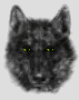
---Wolff On The Prowl---
Richard
---Wolff On The Prowl---
 Member
You never know until you try. I personally like 1 and 2 the best. But 2 is definitely better and would look great on a shirt!
And I agree with Richard - Gary does wonderful logos but he isn't the only logo artist in the world. Your work is great!
I think one of the challenges I like most is logo design. It takes effort and a lot of creativity to get an idea across in a simple and easily printable fashion - and you will feel great seeing your logo on those shirts!

"Wherever you go, there you are."
Randy Allen
 Posting Permissions

 Reply With Quote


Bookmarks