Here is my solution.


 Member
 Moderator Emeritus
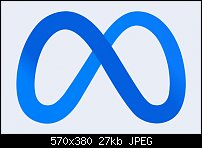
Facebook will still be Facebook. It will be a division or product, as it were, of Meta.
Gary W. Priester
Mr. Moderator Emeritus Dude, Sir
gwpriester.com | eyetricks-3d-stereograms.com | eyeTricks on Facebook | eyeTricks on YouTube | eyeTricks on Instagram
 Member
Ugly logo
Moderator Emeritus
Aside from the logo being unappealing and heavy-handed from a design standpoint, why not have the light strand in front?
Gary W. Priester
Mr. Moderator Emeritus Dude, Sir
gwpriester.com | eyetricks-3d-stereograms.com | eyeTricks on Facebook | eyeTricks on YouTube | eyeTricks on Instagram
 Member
...
-------------------------------
Nothing lasts forever...
Member
I think it's uncomfortable to look at. Logo designers should at least remember the golden ratio.Originally Posted by gwpriester

Moderator Emeritus
I think that is too formulaic.I think it's uncomfortable to look at. Logo designers should at least remember the golden ratio.
I get that the infinity symbol is also a stylized M. It just lacks finesse, kind of like Facebook itself.
Gary W. Priester
Mr. Moderator Emeritus Dude, Sir
gwpriester.com | eyetricks-3d-stereograms.com | eyeTricks on Facebook | eyeTricks on YouTube | eyeTricks on Instagram
 Super Moderator
I didn't say that it was beautiful!
I'm really interested in how you would go about drawing it.
Featured Artist on Xara Xone . May 2011
. A Shield . My First Tutorial
. Bottle Cap . My Second Tutorial on Xara Xone
Moderator Emeritus
Here's what happens if I interpret the logo as a stereogram. Visually the dark section appearing over the lighter part of the band is a disconnect and does not work for me.
Gary W. Priester
Mr. Moderator Emeritus Dude, Sir
gwpriester.com | eyetricks-3d-stereograms.com | eyeTricks on Facebook | eyeTricks on YouTube | eyeTricks on Instagram
Member
dunno gary... the dark over the light works better for me; I see this logo as a stylised set of goggles of the kind Mr Z would have us all wear [hence my last post]
nice stereogram
@ rik - no way could I improve on ernie's offering; has to be the way to go, good on you ernie
-------------------------------
Nothing lasts forever...
 Posting Permissions

 Reply With Quote


Bookmarks