Welcome to TalkGraphics.com
Results 1 to 5 of 5
  1. #1
    Join Date
    Mar 2018
    Location
    Morelos, Mexico
    Posts
    236

    Default Advice on WDP and Android

    I’ve spent more than a year designing our new website in WDP 17. That seems like a long time, but it is for our business, and I had to fit it into my free time (which isn’t plentiful). More importantly, a lot of time was spent learning as much HTML and CSS as possible, and a little JS to boot, following in the footsteps of Acorn and several others here, so that I could gain greater control and make things more efficient.

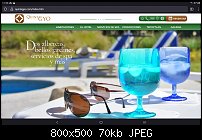
    Please visit the website at www.quintagyo.com.

    Click the language icon for the English version. Any feedback is appreciated.

    On to my issue. The website has three variants, desktop, tablet, and mobile. Pre-publication testing was done on computers of several sizes, 24” PC, 20” PC, and 13” laptop, all using Windows 10. I could find no way to test the website on Android devices before it went on-line, so I relied on how the site behaved when the browser window was reduced to the appropriate width to give me an indication.

    After I uploaded the site to the server yesterday afternoon, I began testing in earnest. The site appears to function correctly in Vivaldi, Chrome, Edge, Firefox, Opera, and even Internet Explorer 11 on the Windows computers.

    Then I turned to our smartphones and tablet. The 10” tablet and a 6.5” phone are Android 10; the other (5.75”) phone is Android 8. In principal, the visible material is supposed to maintain its size while adjustments to the width of the window simply change what is visible along the margins to the side. (I did not use Auto-fit Width.) It is precisely what happens in the Windows testing. But to my chagrin, the smartphones adjust the page size so that the entire width of the mobile variant fits in the screen making everything appear tiny. (That width is determined by the breakpoints calculated by the software. Of course, not all of that width can be utilized in the design since much of the content would be cut off in Windows-based devices narrower than the breakpoint.) The behavior would be expected only if I were using Auto-fit Width, but it occurs on the phones regardless.

    On the tablet, things are also strange. In portrait mode, the tablet displays the mobile version (as expected, given the width). But in landscape mode, instead of displaying the tablet variant, it chooses the desktop variant and squeezes it into the limited space. Even when I zoom in, it maintains the largest variant rather than switching over to the tablet variant. That behavior is different from what is observed on a Windows PC.

    All in all, the way the Android devices display the website is reminiscent of how the Auto-fit Width function in WDP. Yet, my design was not set up that way, and Windows devices do not display it that way.

    So, my question is, has anyone else has encountered this problem or have a suggestion of how to fix it? Does WDP simply not attempt to accommodate differences in the behavior of Android devices? I’m wondering if I’m going to have to go back to the drawing board.

    Any help is appreciated.

    Click image for larger version. 

Name:	mobile-as-designed.jpg 
Views:	54 
Size:	106.9 KB 
ID:	130067Click image for larger version. 

Name:	mobile-as-displayed.jpg 
Views:	62 
Size:	120.8 KB 
ID:	130068Click image for larger version. 

Name:	tablet-portrait.jpg 
Views:	55 
Size:	47.4 KB 
ID:	130069Click image for larger version. 

Name:	tablet-landscape.jpg 
Views:	55 
Size:	70.1 KB 
ID:	130070

  2. #2
    Join Date
    Apr 2012
    Location
    SW England
    Posts
    17,823

    Default Re: Advice on WDP and Android

    It sounds like the Android browser is not recognising the device width.
    I do not have problems generally as I use DuckDuckGo as my smartphone browser.
    That said, your Variant widths seem strange: 848px, 1104px & 1440px. All quite close to each other.

    Your fonts sizes are way too small for Mobile and a struggle (14.4px) for Desktop. I would revisit these sometime.

    What is your worry in not using Scale to Fit Width? This is not the same as Scale to Fit Screen.

    A smartphone Zoom is not the same as a Desktop Zoom so you won't see a Variant switch.

    Acorn
    Acorn - installed Xara software: Cloud+/Pro+ and most others back through time (to CC's Artworks). Contact for technical remediation/consultancy for your web designs.
    When we provide assistance, your responses are valuable as they benefit the community. TG Nuggets you might like. Report faults: Xara Cloud+/Pro+/Magix Legacy; Xara KB & Chat

  3. #3
    Join Date
    Mar 2018
    Location
    Morelos, Mexico
    Posts
    236

    Default Re: Advice on WDP and Android

    Quote Originally Posted by Acorn View Post
    It sounds like the Android browser is not recognising the device width.
    I do not have problems generally as I use DuckDuckGo as my smartphone browser.
    That said, your Variant widths seem strange: 848px, 1104px & 1440px. All quite close to each other.

    Your fonts sizes are way too small for Mobile and a struggle (14.4px) for Desktop. I would revisit these sometime.

    What is your worry in not using Scale to Fit Width? This is not the same as Scale to Fit Screen.

    A smartphone Zoom is not the same as a Desktop Zoom so you won't see a Variant switch.

    Acorn
    I really appreciate you taking the time to look at my site and respond as well as your comments and insights, Acorn. I’ll offer a little explanation of my design.

    Choosing variant widths in WYSIWYG design is definitely an imperfect endeavor. I chose my widths based on statistics from early 2020 on the common monitor sizes in use. I planned the desktop for a 1272px monitor (twelve 80px columns + 24px gutters & margins), the tablet variant for a 976px monitor (eight 104px columns + 16px gutters & margins), and the mobile variant for a 368px screen (four 72px columns + 16px gutters & margins). The containers, set at 1440px, 1104px, and 848px, were back-calculated so that the switch between variants would occur precisely when the content of the larger variant would be cut at the side margins. Admittedly, the mobile width is much larger than 368px, but making it smaller would have caused hiding the side margins of the tablet variant as it was reduced, making parts of the content invisible. So, I went bigger, knowing that some devices (i.e., 500px to 848px wide) would have additional white space in the margin. The only other option was to reduce the width of the tablet content, which would be the greater of the evils.

    Your comments on the font sizes are duly noted. My choices were based on recommendations of Material Design, and for the most part, they are in line with other hotel sites. The normal text is set at 16px, but in some places, WDP reduced it… not in the design project, but in the exported files. I believe it is only in the cases of small caps in which 18px is reduced to 14.4px, and 16px is reduced to 12.8px. Apparently, the WDP program does not make use of the CSS font-variant property to generate small caps, but instead, reduces the font size. I wasn’t aware of that until you pointed it out. The only way I can think of to take more control would be to put the text in placeholders instead of relying on the program.

    When the Scale to Fit Width option (sorry I mistook its name before) first came out, I was very excited to incorporate it into my design. But it didn’t work well for me. I noticed a blur in many instances, and parts of my design just went screwy (things cut off at the edges, parallax working in reverse, etc.) But perhaps the biggest drawback was that to have text sufficiently large at narrow widths meant enormous text at larger widths. For a site with a substantial amount of descriptive text, it didn’t look good.

    Beyond all of those concerns, I still find it odd that the variant widths that WDP establishes are not observed in Android devices. It’s a bit of a dilemma that perhaps should be addressed by the software designers. I did take a look at my site on the DuckDuckGo browser, and it displays the same tiny site as the others.

    Again, thanks for your help. Greg

  4. #4

    Default Re: Advice on WDP and Android

    Gday Greg, I am a complete NOOB at this but my Android (Galaxy S21, 2400x1080) shows the mobile version of my (very basic!) website without issue with both Chrome and the stock Samsung browser.

    I have two variant sizes: 983 with font set at 18px and 465 with font set at 20.

    The 983 variant displays nicely on desktop and tablet/ipad, and the mobile version is quite readable on Android and iphone.

    I have my text in placeholders.

    www.iflewformma.com

    FYI, on an iphone 11, your site displays the same as my Android S21.

  5. #5
    Join Date
    Mar 2018
    Location
    Morelos, Mexico
    Posts
    236

    Default Re: Advice on WDP and Android

    Quote Originally Posted by Hushpower View Post
    Gday Greg, I am a complete NOOB at this but my Android (Galaxy S21, 2400x1080) shows the mobile version of my (very basic!) website without issue with both Chrome and the stock Samsung browser.

    I have two variant sizes: 983 with font set at 18px and 465 with font set at 20.

    The 983 variant displays nicely on desktop and tablet/ipad, and the mobile version is quite readable on Android and iphone.

    I have my text in placeholders.

    www.iflewformma.com

    FYI, on an iphone 11, your site displays the same as my Android S21.
    Thanks for responding, Hushpower.

    Your site does come in properly on my Android phone and tablet. The most obvious difference I notice is that you have no content outside of the defined margins of the variants. While that theoretically shouldn't matter... and in fact, in Windows, it does not, it may be that the content that I have stretching beyond the margins confuses the Android system into thinking the page width is larger than it is designed to be. I will play around with it a bit to see if changing it will also change the display on Android.

    Cheers!


Tags for this Thread

Bookmarks

Posting Permissions

  • You may not post new threads
  • You may not post replies
  • You may not post attachments
  • You may not edit your posts
  •