I made a simple website for the company I work for a year ago and now we need to update it. I haven't use Xara since and am a little rusty at Xara. Looking for someone to help me update the site.

 New Member (No PMs)
I made a simple website for the company I work for a year ago and now we need to update it. I haven't use Xara since and am a little rusty at Xara. Looking for someone to help me update the site.

 Member
What elements are you wanting to update, text, images, add new content, remove content? If you can be more specific, and let us see the site as it is now, we can attempt to point you in the right direction.
You may think you're rusty and the task overwhelming, but going one step at a time and we may have you feeling all new and shiny again
 Super Moderator
Kim, welcome to TalkGraphics.
Your profile might suggest you may only have Xara Web Designer and not the Premium version.
If you have had either product "a year ago", have you bought into the Update Service recently?
If you have not, don't do so immediately until we can determine your exact requirement.
Acorn
Acorn - installed Xara software: Cloud+/Pro+ and most others back through time (to CC's Artworks). Contact for technical remediation/consultancy for your web designs.
When we provide assistance, your responses are valuable as they benefit the community. TG Nuggets you might like. Report faults: Xara Cloud+/Pro+/Magix Legacy; Xara KB & Chat
New Member (No PMs)
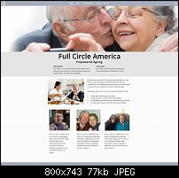
Chris, My website is FullCircleAmerica.com. I need to add a page and update a couple others.
New Member (No PMs)
I'm not sure where to post replies. My website is FullCircleAmerica.com
Super Moderator
Kim, I have looked at your site and while it is simple and relatively lightweight, it has a number of niggles that are not just updates as I consider you need a fuller review & refresh of its current presentation:
- Your company is using a Home Care package (BlissCONNECT) without really offering details of its provenance and what the platform offers.
- It tells me nothing about its origins, customer base, turnover, regulators or other important market information.
- You site is not SSH-secure (the BlissConnect login is) but this is a disconnect that can put some off.
- It has no favicon.
- It presents no metadata about each page's purpose, description or keywords.
- The page titles are sparse.
- The logo is unique but you have set it to render a JPG so you have a white background for a PNG image.
- You have Grouped text and logo so it renders as an image, losing quality in the process, as well as failing to anchor its position over all pages.
- Images and boxes do not all align with the page edge.
- The Xara NavBar should be replaced as it has introduced needless graphics.
- You have not designed for smaller mobile devices.
- All hero images (at least) require image filenames.
- You might consider changing the presentation to a page transition website (a thing I rarely recommend).
- The pop-up testimonials need better placement.
- The mix of italic, underline & different justifications as well as the inclusion or omission of wall shadows jars as you visit different pages.
- You missed the Amazon link to Dr Teel's book:
- As he promotes the issue that "...healthcare costs have soared.", should that not carry over into the site with the company's costs of "how communities care for their elders and presents a plan that benefits everyone."?
- The site currently does not promote the Maine Approach.
I feel that these changes are required for the betterment of the company and its potential audiences and needs eds to be formalised on a financial footing and not just through TG casual assistance.
Sorry if this seems harsh but you are selling a business here.
Acorn
Last edited by Acorn; 18 June 2021 at 05:55 PM.
When we provide assistance, your responses are valuable as they benefit the community. TG Nuggets you might like. Report faults: Xara Cloud+/Pro+/Magix Legacy; Xara KB & Chat
 Moderator Emeritus
If you hope to get the attention and business of the elderly (I consider myself to be one of those) then you really need to make your type bigger.
Also adding Page titles will help elders when they search. Right now your home page only says index which is not working for you.
Gary W. Priester
Mr. Moderator Emeritus Dude, Sir
gwpriester.com | eyetricks-3d-stereograms.com | eyeTricks on Facebook | eyeTricks on YouTube | eyeTricks on Instagram
Member
Kim, you should know that Acorn, despite his name, sits at the top of the tree when it comes to technical abilty. He isn't alone up there, but up there he is. That being said, I shall now shake said tree.
Points 1 to 2 and 17 to 19 - Kim, you state that this site is for a company you work for. Content of the site may not be your call. Maybe show your boss Acorn's suggestion and see what they come up with.
Point 3 - a technical issue to be corrected by your hosting company, not a Xara issue.
Points 4 to 12 - easily solved and well within the scope of the TG community. I would suggest not attacking them all at once, but certainly not hard to resolve.
Point 13 @Acorn - you suggest the possibility of page transitions, why? Genuine question, I don't see any reason to do so.
Points 14 to 16 - totally agree, but again, easy peasy.
I've attached a .web that was created in Web Desginer Premium and covers a lot of the issues Acorn has mentioned. Page name, favicon, named hero image, no Xara nav bar, (badly) redrawn logo. Yes I simply copied from your page, but start to finish took me the same time as it did to drink my second morning coffee. I'd guess 45 minutes.
>>> Full Circle.web <<<
 Member
Hi Kim, welcome to TG. Actually I like your site. It’s nice and clean, well thought out and inspired. As Gary mentioned I would bring the font up to at least 14pts. On your mobile design at least 20 pts.
The pop ups are easily changed to a larger presentation. Just make sure the text in the pop up is easy reading.
Good luck with the rebuild. Stick around on the forum for many more tips. It’s my essential reading everyday.
- Bill
Bill Wood
Charity Web Design
XARA Pro+. WD17, Designer 17. Premium packages.
 Member
Kim,
Your website https://fullcircleamerica.com/ has similarities to an older style Xara template. Not withstanding all the positive recommendations to improve the current site's structure and content, it is relatively easy to move/ add content and pages to the current site. Maybe a first step?
It is difficult though to view the current site on a mobile and if one wanted to do this, the current template is probably not the best starting point.
I took Chris's template, added a mobile variant 540px, increased the desktop variant to 1200px and exported the site with Scale-to-fit-Width, maximum 1200px. Added a large text style, 20px desktop and 23px mobile - site structure scales well from 4k down to a compact mobile. The logo and login are pushed to the browser's left and right with the menu central. The same menu idea is carried over to the mobile variant and placed on its own mobile menu layer, accessed by the usual hamburger icon. The menu is standard text links (no mouse-over), but with a line placed on the mouse-off layer (on each page) to create an underline for each menu this shows which page a visitor is seeing (nice idea Chris).

Full Circle.xar - Here is a template view: https://initiostar.co.uk/demo/fca/index.htm
The overall thought process in any redesign should be to consider mobile and desktop at the same time. This ensures a natural transition from landscape to portrait. Inevitability this means considering how best to display content across multiple devices before fixing on a desktop design.
I added a named colour for the page and pasteboard backgrounds (both the same) this avoids the old style page border seen in older templates. The Mouse-over also uses a named colour along with a base colour for the site.
It would be relatively easy to copy and paste content from the current site to the attached template, in parallel with adopting all other positive recommendations.
Gary
 Posting Permissions

 Reply With Quote
Bookmarks